We have confirmation of Sabres’ new logo
As you may have noticed, these posts have been a bit sporadic. We’re both in the process of going back to school, so we’ve been extremely busy. So, to make up for it, here’s a cute little story for all of you:
Summer was ending. The kids were getting ready to go back to school. Derek and I were out shopping this fine Labor Day and happened to stop by an unnamed, local sporting goods store.
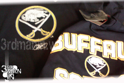
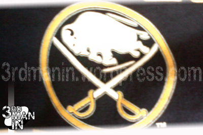
While perusing the merchandise, naturally looking at the Sabres apparel, we noticed that the logo on the shirts was the new third jersey logo.
We both picked up a shirt, so if someone figures out that these aren’t supposed to be on shelves yet, we have proof. Licensed, Reebok apparel.
Here are the pics:
As far as the jersey goes, while there has been no leak of the jersey design (we won’t be able to do that for you, so don’t even ask), this kind of confirms what showed up on icethetics a while ago as far as a logo is concerned.
And, I’m gonna guess that those shirts weren’t supposed to be out quite yet… so we’ll see what happens.
Posted on September 1, 2008, in Sabres/NHL and tagged 3rd Man In, Sabres, You won't see this anywhere else. Bookmark the permalink. 20 Comments.


Sure that’s not just merchandise with the vintage logo?
It’s not the vintage logo. The vintage logo doesn’t have detail striping.
They also have 2008 rbk “faceoff” tags.
Where did you guys find these?
We’d rather not point it out, because we’re not here to get anyone in trouble… but it was at a rather “major” retailer in the Buffalo area.
I see the Sabres going back full-time with the vintage crest and uniform design, but with the updated colours for their 40th anniversary(’09-’10) or 40th season(’10-’11). Now, let’s hope by then, my Vancouver Canucks, the Sabres expansion cousins, drop the orca and go back full-time with the original Stick ‘n Rink C or the Johnny Canuck V.
Nice grab.
Great work and a great find!
I think they finally got it right with this one…They smartly changed the vintage elements just enought that it would pass as a primary jersey. I hope that is what happens and they fade out the slug or at least make it the third jersey during the 40th anniversary season.
Be sure to check out my blog as well on what to expect on September 20th.
http://sabresnotslugs.blogspot.com/2008/07/what-i-expect-from-sabres-september.html
Thanks for the compliment. However, I disagree. I am very over the “no slug” talk. And I actually like the jerseys.
I say the team is inviting the debate to return since they are introducing a vintage style jersey again. Not every team is bringing a third jersey this season. Columbus for example. I know some people are over it just as there are people who still hate it. I think the only reason this jersey is being delivered is to appease the fans just like they hastily brought the vintage jersey back for 15 games in 2006 with no matching pants and helmets. And I like the new jerseys too…definitely, the styling is great, colors are great, it’s simply the logo that ruins it. It’s too yellow and looks too much like a legless Buffalo Bills logo or many other things before it looks like something that represents Buffalo Sabres hockey. It’s terribly unoriginal. There is lots to like about the jersey and slim to nothing of the logo in my opinion.
But either way, I’m excited to see the whole package and then we’ll find out if there is a backlash for change once again. Just take a hard look at what is unveiled on the 20th and ask yourself what looks better! Take it easy! Great blog guys!
Thanks for checking us out, come back for more.
As far as the logo goes, i’m fine with them. I grew up with the goat head…how about that? I’d much rather see a yellow buffalo-ish thing on a white/blue jersey than a goat in red and black, but hey, that’s why I do this for free.
Goat head was way better than the slug… the slug jerseys are UGLY. Not just the logo, the jerseys as a whole. They try too hard to make them look “modern” and flashy… just plain awful.
Very Boring Re-design. 3rd Jerseys should be dynamic and new. This is just a lame rehash of the original. Too Bad.
I dislike the slug jerseys. The 99-2005 jerseys were not that great eathier. The Buffalo Sabres should have stuck with the old vintage jerseys. Notice how the Origonal 6 teams have never changed their logo. The Sabres should do the same. I am a big fan of the new 3rd Jerseys. I think it would be great for the Organization to make the 3rd jersey their Home and make a white version for an Away. For a third Jersey the sabres should make a Gold jersey With Block Letters saying SABRES on the front, as well as another design such as a hockey stick and a puck underlining the word sabres. It is clear that many people dont like the Slug very much. With the right people we can take the jerseys to another level of design but still keep that old school look. GO SABRES
there are sporting goods that are very cheap but the quality is not very good `;*
I want to encourage that you continue your great job, have a nice evening!
I’m more than happy to uncover this great site. I need to to thank you for your time for this
fantastic read!! I definitely loved every part of it and I have you book marked
to check out new information on your site.
Do you have some sort of junk mail matter within this site; We likewise ‘m the tumblr, and We has been questioning your circumstances; most of us are suffering from a few pleasant strategies as well as were aiming to trade approaches along with other folks, why don’t you shoot everyone a great e-mail when serious.
I love just what I view therefore now i’m pursuing a person. Anticipate looking into the web site consistently.
Pingback: Break Out the Ortho