See more of our Nickelodeon posts here.
Nickelodeon Logo Logic Designed by Sheri Dorr & Laurie Kelliher Creative Director: Scott Webb
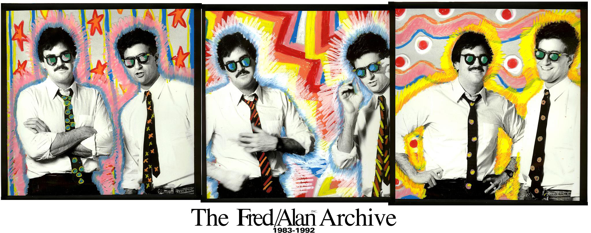
Tom Corey, Scott Nash, and Alan Goodman are the key guys in the Nickelodeon logo saga.
Back in the day my partner Alan Goodman and I were known as the logo guys. It was both flattering and annoying, because we’re not designers and it deflected attention from the brilliant people we worked with often, like Manhattan Design (Frank Olinsky, Pat Gorman, and Patti Rogoff designed MTV’s logo) and Corey & Co. (who designed Nickelodeon’s). But after we became known as the group who developed (not designed) the MTV logo, our reps were set in stone for a while. Eventually we were able to morph it into the idea of developing media brands, which more accurately reflected how Alan and I thought of ourselves.
After setting the vocabulary (more important than design in many ways) and “look” of MTV Alan and I left MTV Networks to set up our independent Fred/Alan Inc. and our first client was… MTV Networks. By 1984, the five year old Nickelodeon was in trouble, having lost an accumulated $40 million (that’s in 1980’s money, more than $200 million today) and worse, it was the absolute lowest rated cable network in America. Dead last. MTVN chief Bob Pittman asked Alan and I to help and introduced us the network’s eventual president, Gerry Laybourne. It was a tough decision for us to make since we were broke but had no interest in children’s television or the people who worked in it. The ‘broke’ part won out.
The key decisions we made:
• Keep the name “Nickelodeon.” We figured that 10,000,000 kids (their 1984 circulation) knew the name and what it stood for. Management wanted to switch to “Nick,” since it was easier to spell and say; let’s forget that everyone outside the company would wonder why they were named after a garage mechanic. There were a lot of reasons for killing it: no one under a certain age had ever heard of a nickelodeon, and those who had knew it had nothing whatsoever to do with children; the word was hard to spell correctly in the age of pre-Google and spellcheck; and, the word was way too long and thin to dominate a television screen. Ultimately, we all agreed that whatever equity existed in the name was a valuable headstart.
• Treat the network like an exclusive club, where only kids could join, not like a generic “TV station” with all kids shows. Kids in June of 1984 (when we started work) needed something they could call their own. They felt on the rear end of life, they told us so constantly. Adults (parents and teachers) made all the decisions for them. TV in the 80s wasn’t for them. They were scared of getting older, but their unconscious biology kept egging them on to age faster.
• Ban the word “FUN” from the Nickelodeon vocabulary. Every network promo told the kids that Nickelodeon was fun. It wasn’t. We thought it was better to be “fun” than say “fun.”
• Redesign the logo. Famous television designer, a moonlighting Lou Dorfsman, had designed the logo in 1981, and our brilliant friend Bob Klein had added a silver ball that zoomed around the screen in and out of everything a kid might find exciting.
Alan and I didn’t find it exciting. We’d been working a lot with a new friend, Tom Corey, who owned Corey & Co. (tragically, Tom’s passed away, his companies are now called Corey McPherson Nash & Big Blue Dot) in Boston. He came down to the Fred/Alan office in New York with his partner Scott Nash and heard our pitch for the network. we told them about our decisions I talked about above, and told them while we didn’t know anything about kids’ programming we knew that the offices of Nickelodeon were as quiet as a chapel (as one of the internal wags put it) and that in order to spice the place up we hoped that when our jobs were done they’d all be shooting spitballs at each other. Tom and Scott dug in eagerly.
I wish I had their presentation. It was pretty informal –a bunch of logos sketched on a page– and none any of us were all that crazy about. Eventually, we settled on one that was 3D in nature that revolved around itself (not unlike the Nintendo 64), and kind of a standard designer treatment of a trademark. We were about to settle when Alan spoke up and said he didn’t think it was in keeping with our reputation as moving image thinkers about logos.
The MTV logo had been sold in with two thoughts. 1) Rock'N'Roll was a dynamic constantly changing medium and a logo should have a built in updating mechanism. And 2) More importantly, television was moving pictures. Logos were generally designed by print designers who wanted a perfect image, then handed off to moving image designers who had to figure out how to make the damn thing move. Often, it ended up with a big hunk of metal hurtling through space, cause what else were they going to do? We’d argued that in the 1980s that was a dumb thing to do. Why not just design a logo with movement baked into the conceptual frame right from the beginning? TV was the most important place to see the logo, and print designers could just *STOP* the motion and pick an image for an ad; it would be more dynamic even in the print that way.
Alan pointed out that’s how we’d made our bones, and besides, we were right, darn it. Movement was the way to go, constant change made for a energetic network, and kids were the most vital force in the world. Give them something they relate to: change. He was looking at the orange splat on their page. Tom and Scott argued that orange generally clashed with everything and that would make the logo stand out (as long as we didn’t let designers try and make it work “correctly.”) The splat could morph into any image we liked. And it wasn’t the MTV version of change. I came along for the ride that Tom, Scott, and Alan were proposing, and we trucked over to Bob Pittman’s and Gerry Laybourne’s office to make the pitch.
Bob and Gerry didn’t buy it. No one else there did either. “It doesn’t match anything.” “It’s flat. You guys do all the MTV logos with lot of color. Shouldn’t we have colors?” “It’s not as cool as the MTV logo, what happened to you guys?”
Ultimately, we prevailed. I’m not really sure how, since all their objections were right on. But we were the “logo guys,” so they eventually bought our action. I’m thrilled they did, since our work with Nickelodeon is some of my favorite stuff in our careers. Tom and Scott went on to be among the premiere designers in television and kids (Scott’s now one of the leading children’s book authors and illustrators), Alan’s a successful producer and brand strategist (still consulting Nickelodeon), and they all deserved the accolades the world could throw at them.
(By the way, the book Nickelodeon Logo Logic was put together in 1998 by Sheri Dorr and Laurie Kelliher at their in-house creative services department after Alan and I had stopped full time consulting to the company six years before. The company had expanded so dramatically and so many people had trademark needs that without us –the “logo police”– around Nick’s Worldwide Creative Director Scott Webb needed some objective rules set down for designers and marketers to follow. I’m not so sure we’d agree with all their points but a trademark is a dynamic thing. Different people interpret it different ways, kind of like a musical composition, and it’s natural it’ll be looked at in new ways over the years.)
Update, 2010:
• Nickelodeon discontinued use of this logo after 26 years. They call it a “rebranding.” We would probably beg to differ.
• On his website, advertising executive George Lois claims to have designed the Nickelodeon logo. Since Fred/Alan developed the logo directly with Tom Corey and Scott Nash, his assertion is clearly false.
–Fred Seibert, 2009