This is one of the most clear cut well executed pieces of design I have seen in a few years and I love it.
On it’s own, the change from the old logo here:

To the new one here:

Is not that significant, but then again, logo’s never look too much on their own anyway, do they?
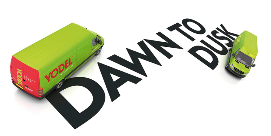
But when you start to add some meat to the bones, it starts to come to life.

It was done by an agency called The Clearing who have a project page here. My only slight reservation, which could still change its success is this little comment that appears under the YouTube video that they have used to launch the project.
It was posted by someone called mrtikle 1 week ago and he/she says “the company still have no money and continue to treat its staff like dogs”
As I have said many times before, if this rebrand marks a positive change in behaviour, then it may succeed, if it is just a new logo for a still crappy company, then it will still fail. Time will tell, but you can judge for yourself.