I was shown some rather nice small samples of slip casting earlier in the year which got me to thinking about some possibilities for future student typography projects and have decided to try it out with the guiding hand of expert sculptor, 3D guru and all round good egg, Ben. I started this towards the end of March and have been experimenting ever since (the ampersand was a direct result of these early explorations). I have tried to photograph each stage as well as I could, but sometimes didn’t get good enough images, or forgot to take the camera, or was just so filthy I couldn’t even bring myself to touch the camera!
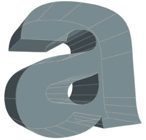
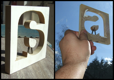
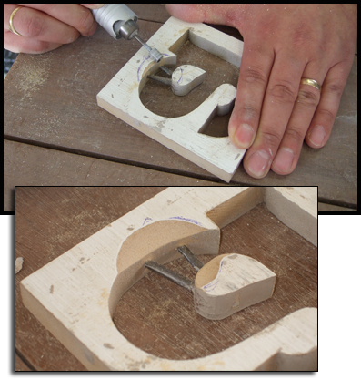
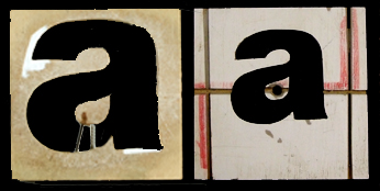
First I needed to create an extruding die first to fit in the extruder, which is just like the PlayDoh barbershop tool! I selected the lowercase ‘a’ from Helvetica 95 Black (and why not?) and enlarged it to fit within a 90x90mm square. The print was trimmed and spraymounted onto a block of MDF. After drilling a pilot hole, I carefully cut out the letter on the band saw, and used files and sanding belts to refine the edges. The counter was positioned with two metal rods, drilled through the outer frame and superglued in place. The clay would eventually be pushed through this die, and reform after passing through the rods. That’s the theory anyway, we’ll see tomorrow! The die was then compared to a second copy of the original printed character to check the position – and it was pretty much on the spot too!
The finished template has a certain charm I think, and the two supporting rods add a kind of Heath-Robinson quality to the thing!
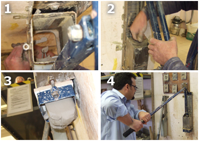
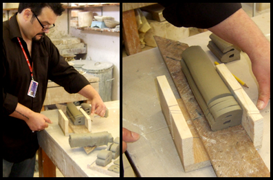
… Back to the 3D workshop today for an extrusion! Firstly, the die needs firmly securing in the extruder before forcing in a huge block of clay (1). The press section is put into the top of the extruder and with some steady pressure pull the lever down (2 + 4).
The extruded clay oozes out (with some good farty noises!) of the bottom and removed with a wire (3). The first attempts were not too good as the clay didn’t ‘repair’ after passing through the two supporting rods.
We decided to modify the die to try and encourage the clay to flow around the rods better, by milling a recessed area on either side leading to the rods.
This improved the extrusion, but not by much, so a further modification was made to the recesses, milling the rounded edge to more of a point. Again, this improved the extrusion, but again, not by much.
Ben advised me to make another die, slightly smaller this time, and position the counter space of the letter in the centre, so we could use another form of securing it rather than using rods. So its back to square one. Disappointing, but having seen the next solution working perfectly, it’s definitely worth it. Plus, I think I’ll improve on the curves the next time around…
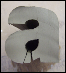
The next die was slightly smaller, allowing the counter to be positioned centrally, allowing a thin angled bracket to be secured to it, allowing the clay to ‘heal’ as it passes through. The grooves are where the bracket sits to allow the main die and the counter to line up.
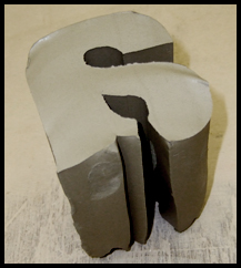
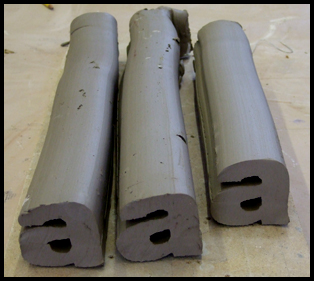
I went through the extrusion process again (forgot to take a camera but the process is just the same as before) and got three long well formed ‘a’ logs:
These were transferred to a jig where I sliced each one with a wire, starting off with the rougher parts for practice. I cut some thin slices first, and went on to cut a variety of thicknesses, wedges and angles, finishing with a few mad slices to explore the technique further.
I doubt I’ll use these last ones, but I’ll see how they go. These were then left overnight in the damp cupboard to slowly harden to ‘leather hard.’
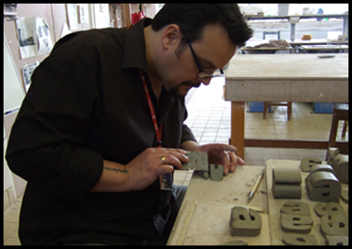
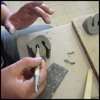
Once sliced, these were left to air dry in the workshop for a few hours, allowing them to become a little firmer to the touch and not mark so easily. I needed to trim and clean them a little further with some splendid and mysterious hand tools like this thin metal strip called a kidney:
and these double ended square and rounded hoops:
I’ll finish tidying these up tomorrow:
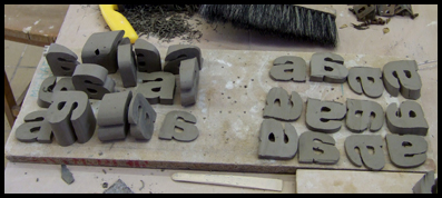
Well, the majority of the letterforms were left to air dry over the Easter break, and then fired in the kiln. At 100° every hour, for six hours, reaching 600°! The one destined for making into a mould was left in the damp cupboard.
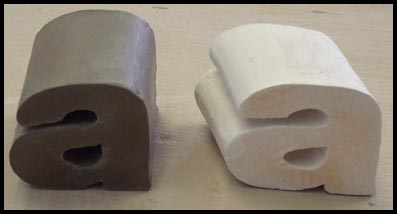
This is what the kiln fired one looks like next to the hard clay. The ones from the kiln here very hard now, and no longer workable, whereas the hard clay one could still be worked on, if only in a limited way.:
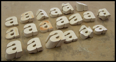
And the collection of those fired…
There is quite a lot to follow on from this so I’ll post more in a week or so on the glazing and mould making stages…

i love typography!! this is amazing how type faces and shapes are made. im loving this
Glad you like it Nina. I’ve really been enjoying doing this after so many years designing on screen – it feels like a bit of therapy too! There are another couple of posts to follow this, so keep coming back – and tell your friends!
what do you DO With this?
Fascinating process even though I’m missing the why and whatfor parts!
I mean, I do know what typefaces are but the link between your physical letters and the printed word is what’s missing for me.
Thanks!
Good question. I don’t do anything with it I suppose. I am experimenting with materials I haven’t used since the late 80’s and just enjoying the process of creation and exploration with real materials, having spent much of the last two decades staring at a computer screen.
The link between printed type and 3D letterforms is a little harder to pin down. I learned about typography by hand-drawing letterforms in different styles and sizes, and using composing sticks and copyfitting tables just as the AppleMac was being launched. Having taught typography by hand (yes, my students still carefully draw letterforms) and on screen, I am exploring how making 3D letterforms can enhance understanding about typographic anatomy and detail.
Also, they are kind of nice little things to handle and have scattered about. Keep tuned to the blog to see how these progress…
A quick translation in http://ets.freetranslation.com/ reads:
“In its blog Lestaret, this graphic designer carried out a genial publication in which details step by step as to create typographies with ceramics. I expect that they enjoy it”
An interesting Spanish bookmarking site.
Just found a link to this page from Notcot.org!
Yeah! It’s great! I get loads of traffic through from there – this was posted in May (09!)