What Makes a Good Photo? – Analyzing Photo Popularity on Flickr
In 2016, I took a Digital Humanities course during my last semester at Princeton. The project I undertook in the second half of that semester was rudimentary analysis of the relationships between the popularity of photographs on photo-sharing website Flickr and ways in which they were created. Below are some of the results from that analysis, along with this disclaimer: these visualizations are not correlations, nor should the explanations accompanying them be considered claims of causality. I present simple visualizations to tease out simple relationships between the ways a photo was taken and how well it performed on the site.
Introduction
In photography communities, a debate regarding the nature of the art rages. In one philosophy, the quality of a photograph (or a photographer) lies solely in their creativity, their artistic vision, and the subject matter that they capture. For those in this camp, photographic equipment (cameras, lenses, tripods, etc.) are simply a transparent tool by which photographers capture what they see. Those opposed to this philosophy pay more attention to the physical and technological limitations of the equipment when pursuing their craft. These limitations can in many ways shape and in some cases dictate the types of photos that can be taken, and for some photographers, the capabilities gained and lost through the use of different “gear” limit their creative freedom significantly enough that they prioritize the equipment to a much larger extent than the first camp would.
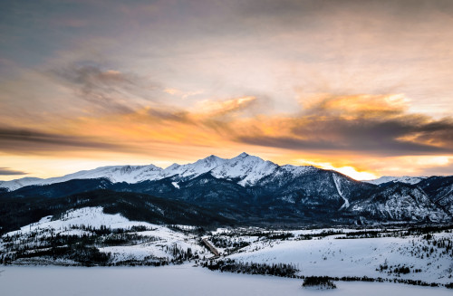
A landscape photograph taken with a DSLR camera at a relatively small aperture of f/8. Because of the narrow aperture and large distance between camera and subjects, everything in this photo is in focus.
Let us explore an example. In optical lenses, the aperture of the lens is an opening near its rear that controls how much light passes through the lens. The aperture can close down to a size as small as a pinhole (this is denoted in photographic metadata by a large “f-stop” number like f/16 or f/22). The aperture can also open up to allow a larger amount of light in (this is denoted with a small f-stop like f/2.8 or f/1.4). As the f-stop decreases, the size of the aperture and the amount of light passing through the lens both increase. Aperture has another effect besides controlling the amount of light entering the lens, and it is one of the most creative tools a photographer has to change the way his/her photos appear in the camera. Because of the geometry of light passing through a lens, a wide open aperture will result in everything closer or farther than the focal point of the lens (controlled by focusing) being out-of-focus. This is referred to as shallow depth-of-field, as the normal plane of space at some focusing distance away from the lens within which objects are sharply in focus is very thin. Moving just a small amount away from the focal plane either forwards or backwards will cause blurring. The effect of blurring the background behind a close object can be quite visually pleasing, and the appearance of blurred backgrounds is called “bokeh.” For this reason, portraits are typically shot with wide open apertures (an example is shown below). On the contrary, closing down the aperture to a small hole causes the focal plane to expand to be quite thick, resulting in objects at varying distances being in focus, whether they were focused on or not. Landscape photography is typically done using stopped-down apertures to maximize the portion of the frame that is in focus.

A portrait of me taken with a DSLR camera at a relatively wide aperture of f/1.8. Note the in-focus subject and heavily blurred background.
Because professional photographers tend to take photos of people using a wide aperture and consequently shallow depth-of-field, that particular look is often associated with professional quality, especially by people who are not professional photographers. The logic is simple: because only professional cameras can create that particular look, the look is associated with professionalism. This psychological connection between a technical aspect of a photograph and its perceived quality is the main focus of this project. Over the course of the project, we have done the following:
- Developed an application to gather technical and other metadata for thousands of photographs published in an online community.
- Cleaned the dataset and wrote another program to parse the existing data and supplement it with additional information based on the gathered data.
- Generated visualizations showing the relationship between key technical and authorial aspects of the photographs and how well they performed in the online community where they were published.
Data Gathering
Source
First, the source of photographic data was selected. Flickr was chosen for a number of reasons. It has a large body of photographic work going back decades, its user base is active, it hosts work from a wide range of photographers, from amateurs to professionals, it collects and displays large amounts of metadata (including EXIF data) for each photograph, and it provides relatively simple means to access each photo’s metadata.
After selecting the source, we registered an application in Flickr’s developer portal in order to get access to the Flickr API. Then, we developed a Python application to gather the data desired for analysis from the public sections of Flickr’s API. The application was built to achieve a few main objectives:
- Authenticate with the Flickr API using the private key provided by Flickr’s developer portal.
- Generate a list of dates from which to gather lists of photos.
- Send a request to Flickr’s “interestingness” endpoint to get a list of photos that were heavily engaged with during each day in the list, going back approximately one month.
- Concatenate every photo acquired in the previous step into one large (~12,000 photos) list. Then, use an array of different API endpoints to gather the appropriate metadata for each photo, including EXIF data, titles and descriptions, tags, views, and favorites. During this step, some photos may be private, so handle any errors thrown by Flickr’s API regarding denied access.
- Parse the responses from the previous step to select only the fields relevant to the project and transform them into a readable and/or useful format.
- Connect to a local instance of the MongoDB database and store the full record of metadata for each photo into a database collection for future access.
The final list of photos included over 8,000 of the most engaged-with photos on Flickr posted in the first 20 or so days of May 2016. Photos that were marked private by their owners or were posted without EXIF data were ignored. For some photos, some fields may be blank, and those fields are generally just ignored in our analysis. The full data-gathering process took around 8 hours.
Data Cleaning & Supplementation
After the data had been inserted into the database, work began to clean it. First, the data was exported from the database into a usable CSV format using the mongoexport tool provided with MongoDB. Then, it was imported into an OpenRefine project. The full OpenRefine edit history is provided in Appendix B, but the major steps are outlined below:
- Major revisions were made to the “Flash” column, which indicates whether or not the photograph was taken with a flash or not. Cameras tend to fill out this EXIF field in a number of different ways, depending on the type of flash used and brand of camera. Clustering and faceting was used to reduce every possible value to either “Fired” or “Did not fire,“ indicating simply whether or not a flash was used for the photograph.
- The exposure mode field is similarly varied across camera models and brands. Every possible value for this field, which represents the shooting mode the camera was in when the photo was taken, was condensed into two options: “Auto” or “Manual,” to indicate whether or not the photographer manually exposed the photograph by controlling all 3 of the major settings (Aperture, Shutter Speed, and ISO) or if the camera was in an automatic mode, which includes both full-time auto modes for beginners or the semi-automatic program, aperture-priority, and shutter-priority modes. The semi-automatic modes are used often even by professional photographers, so this field should not be taken to represent the skill of the photographer, but rather whether the photographer manually exposed the photograph or not.
- In many other fields, especially the numerical ones, simple cleaning was done to elimitate nonsensical values.
- Duplicate photos were checked for, but Flickr’s API apparently does not provide duplicate values across days.
Once the data was sufficiently cleaned, it was exported from OpenRefine in Excel format before being imported into MATLAB for the next step.
In the supplementary phase, a MATLAB script was written to parse the imported data into formats usable for analysis in MATLAB. For example, a photo’s shutter speed could be represented either in decimal or fractional format, but MATLAB’s built-in number parser does not handle strings that represent numbers as fractions. Some code was written to detect these cases and manually parse and calculate the decimal value for these photos.
Also, many of the fields were analyzed for content not originally present in the dataset, and additional fields were created to supplement the dataset with information of particular usefulness to the visualizations yet to be created. These extra fields are outlined below:
- Metadata: A column called “metadata” was created to represent the sum total of accompanying metadata that was provided by the photographer with the photograph on Flickr. This included the title of the photo, its paragraph-format description, and any tags added to the photo to aid in its discovery by other users. The field itself was calculated by adding together the length of the photo’s title (in words), the length of the photo’s description, and its number of tags.
- Popularity: The popularity of a Flickr photo is quantified in two ways. First, each time any person browses to the photo on Flickr.com, that visit is counted as a “view.” Second, logged-in Flickr users can also elect to “favorite” a photo, indicating their appreciation of the photo to its owner or simply saving the photo for later viewing. Because the dataset had two separate metrics to estimate a photo’s popularity on the social network, a formula was created to combine the two values in a representative way for each photo. Using MATLAB, the mean number of favorites and views for the entire pool of photos was calculated, and it was found that on average, the photos received approximately 36 times more views than they do favorites. In light of this, the final normalized “popularity” value was calculated by multiplying the number of favorites a photo received by 36 and adding that to the number of views it received. This single “popularity” value made analyzing a photo’s success in the community much easier.
Results
Again, please see the disclaimer at the top of this post. These visualizations are for curiosity’s sake, not rigorous statistical analysis.
Hypotheses
We hope to see a number of patterns in the data once visualized.
We would expect to see a bimodal pattern emerge when relating aperture to popularity, as both very low and very high apertures are used for photographs that are quite popular (the bokeh-laden portrait look at wide apertures and striking landscapes using narrow apertures). Aperture values near the middle of the range (between f/4 and f/7) can be useful in some circumstances, but more often than not, they are the values used by cheap lenses afforded by very amateur photographers, and as such we would not expect very good quality in general from this audience.
Shutter speed depends highly on the circumstance of the photo, and no clear pattern is evident regarding which shutter speeds might attract more more popularity, so we would expect this distribution to be quite flat across the range.
We expect to see that photos taken at lower ISO values will be more popular, as the camera’s base ISO produces images with the least noise and the highest dynamic range. Both of these are desirable aspects of photos, so we expect to see a roughly inverse linear relationship between ISO and popularity.
We also would predict that photographs with more overall written metadata would perform better than those with sparse information, simply because having more metadata makes a photo easier to find on the Flickr website.
Visualizations
The inferences presented in this section are mostly speculative as to the causality driving our observations. While they may adequately explain many of the witnessed phenomena, the relationships are not necessarily causal.
Aperture
Aperture was visualized first, and a number of attempts were made to adequately represent any trends in the data. Initially, scatter plots were attempted, as shown below, but to quite limited utility. Despite plotting the full population, it is difficult to perceive any relationship between the aperture value and popularity, due to the relatively wide variance among photos taken at any given aperture value. However, the plot is useful in revealing that f-stops are not a continuum of values, but rather a discrete set of values dictated by the incremental opening and closing of a lens’s iris. We can also see some interesting details regarding the aperture values most present in the dataset. As we might expect, Values between f/2 and f/10 are most prevalent, as they are the most useful for everyday shooting conditions. We can ignore the values at 0, as they are not actual data points but incorrectly-parsed values. (These values are ignored for all following visualizations.) Today’s widest commercially available lenses only offer apertures as low as f/0.95, though the vast majority are f/1.8 or higher.
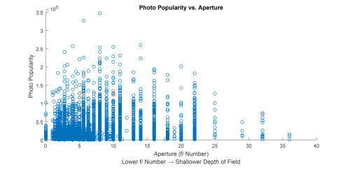
[Larger] Popularity vs. Aperture as a scatter plot
Moving to the figure below, we do see some interesting patterns. The methodology behind this plot is shared among the remainder of the bar plots in this post. In general, we collected the photos into a discrete set of bins covering a certain range of aperture values. Those bins are not evenly spaced, but rather arranged to include very common aperture values and to be able to express the differences among those values by separating them into different bins. For each bin, the median popularity of photos with aperture values falling into its range is calculated, and that value is plotted in the bar graph. While the variance in any bin can be high, this seems to be the only way to visualize how changes in aperture (or shutter speed, or metadata quantity) affect the likelihood of a photo to be popular.
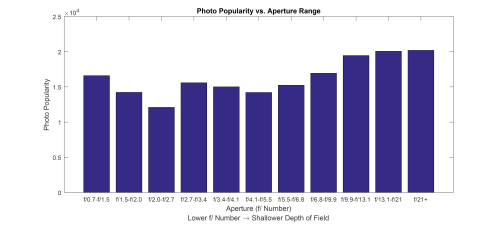
[Larger] Median Popularity vs. Aperture Range
We can see some interesting patterns as we move down the aperture scale. Photos taken with exceptionally wide apertures (f/0.7 to f/1.5) typically perform quite well on Flickr. This is somewhat expected — lenses that offer apertures this wide are very expensive and generally only affordable by professional photographers. Photos taken this way also provide a dreamy bokeh look that many people find appealing. The next step up is the range that includes f/1.8, the minimum aperture of many inexpensive prime lenses purchased by pro-sumer photographers. While these photos don’t perform as well as the widest apertures, they still do respectably. The next bin contains the aperture value used by the world’s most popular camera, the iPhone, at f/2.2. Despite the relatively low f-stop, the iPhone’s sensor is very small, and so the depth-of-field of its photos is generally quite large, without the bokeh that generally characterizes this range of apertures on APS-C or full-frame cameras. Despite the relatively rich iPhone photography ecosystem, photos in this range (which should contain overwhelming numbers of iPhone photos, given Flickr’s own statistics on camera popularity) performed the worst of any other group. The next bin contains f/2.8, the maximum aperture value for most professional zoom lenses. Many professionals shoot with a 24-70mm f/2.8 lens, and so we see a relatively unsurprising increase in popularity for photos in this range. Normally, when aperture is used creatively, it is done to create deep or shallow depth-of-field. Values in the middle (such as the next three bins, from f/3.4 to f/6.8) are not necessarily notable for the depth-of-field they create, so most photos taken in this range might not emphasize aperture as a creative element of the photo, instead controlling the value simply to affect the exposure of the photograph. It is interesting to note, though, that photos in this range performed about as well as the f/1.8 range. The last interesting pattern is the popularity of photos taken with very narrow apertures. In most cases, photos taken in this way are taken outdoors in daylight (narrow apertures demand a large amount of light for proper exposure), and the most common photos taken in this way are landscape photographs. This genre of photography is undeniably popular, but it is extremely interesting to see that these photos tended to perform better than extremely wide-aperture photos.
Shutter Speed
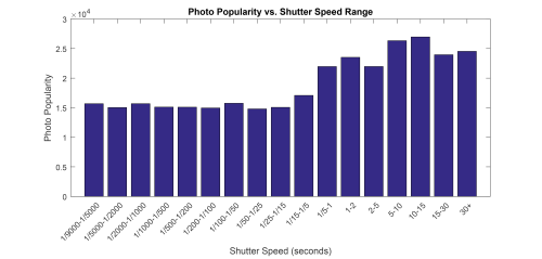
[Larger] Median Popularity vs. Shutter Speed Range
Next, we consider the figure above, which treats shutter speed in the same way as the last plot treated aperture. Most photos are taken in the range between 1/4000 and 1/10 of a second, and in our data, photos in this range generally performed about the same across the range. Shutter speeds in this range are generally suitable for handheld shooting (fast enough to avoid motion blur caused by shaky hands), or, on the faster end, they are aimed at freezing moving subjects (or simply limiting how much light can hit the camera’s sensor by shortening the exposure time). The most striking feature of the chart, though, is how incredibly popular long-exposure photographs are. Long exposure photography is a creative way to allow a camera to capture scenes that the human eye cannot, whether that entails exposing for long periods of time to give flowing water a silky appearance or light-painting (a technique wherein a person moves a light source during the exposure to paint out some shape). It’s understandable why these photos might perform well, though somewhat surprising that the difference in popularity was so noticeable.
Author-written Metadata
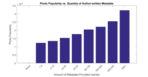
[Larger] Median Popularity vs. Quantity of Authorial Metadata
Another revealing visualization is this one. In this figure, we see perhaps the strongest relationship between one of our variables and photo popularity. As we predicted, the amount of written metadata attached to a photograph on Flickr is nearly directly proportional to its popularity in terms of views and favorites. We would expect this trend in terms of views, since having more detailed titles, descriptions, and tags would obviously make a photo easier to find on Flickr, but since we weight favorites so highly in the popularity score, this trend must have also carried over to the number of favorites each photo received as well.
ISO
[Larger] ISO Ratings Sized by Popularity
As for ISO, the data in above seem to confirm our initial suspicions. This visualization, generated with RAW, shows unequivocally that photos taken at or near a camera’s base (lowest) ISO value perform much better than photos where the ISO value needed to be raised. In general, except in the most expensive cameras, raising the ISO reduces image quality by limiting the dynamic range of the photograph and introducing unpleasant-looking noise. The utter dominance of ISO values below 1000 (which in most cameras are relatively noise-free) in the visualization offers only one piece of advice: if you want a photo to take off, keep the ISO down.
Exposure Mode & Flash
In the remaining technical metadata we gathered about the photos, the two that are qualitative are exposure mode (whether the camera controlled some or all of the settings to ensure the photo was properly exposed) and flash (whether or not one was used). The alluvial diagram below is sized by popularity, and it shows a couple of interesting features of the dataset. First of all, it is clear that photos taken in automatic exposure modes perform better on average than those with manually-controlled exposure. This is somewhat surprising, as many professional photographers swear by shooting only in manual mode, believing that the extra control it affords them can produce superior photographs. Second, it seems that photos taken using natural light perform much better than those that employ flash. This is also surprising, as most professional photoshoots make use of at least some form of flash. However, it is possible that those photographs are generally used for commercial purposes and not posted to Flickr, so there may simply be fewer professional examples of flash among many more amateur examples in the dataset.
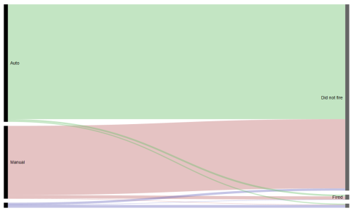
[Larger] Alluvial diagram showing the photo dataset in terms of exposure mode and use of flash, sized by popularity
Limitations
Changing the Photo Set
In the work completed so far, the list of photos comprising our dataset were taken from Flickr’s daily lists of the 500 most “interesting” photos. “Interestingness” is defined by Flickr in a proprietary way, but one can assume it represents some combination of popularity and engagement from the community. However, since the analysis done attempts to make generalized statements about the photography in general, using only photos from this set may limit the external validity of any findings. In this project, this group of photos was used simply because it is the easiest way to obtain a large, somewhat random group of photos via Flickr’s API.
Rigorous Analysis
While the visualizations presented offer some interesting insights into the nature of how people perceive photography, it would do the project a great justice to perform more rigorous statistical analysis on the underlying data (regressions, correlations, etc.). These were omitted from this prospectus due to limits on time and statistical competency.
Expanded Visualizations
More visualizations incorporating more aspects of the photos could certainly be made. Specifically, it would be useful to see visualizations making use of more of the data points we gathered in our dataset, including focal length, the maximum aperture of the lens used, or the camera type.
Other Data
It also may be useful to gather additional data points for each photo, including, for example, the number of comments the photo received, which could be incorporated into our popularty metric, the editing software used to post-process it, or whether the photo was shot in RAW or JPEG in the camera. These data points were omitted due to the time required to re-fetch all of the data.
Content Analysis
A more robust analysis might also include analyses of the photos themselves, rather than just the metadata. Certain aspects of the photos, including their overall brightness, saturation, and contrast, would be interesting to analyze with regard to photo popularity.
A Note on Windows 10 UWP Apps & Mobile Graphics
I’m a big fan of UWP apps on Windows 10 (formerly known as “Metro,” then “Modern” apps). These are the new type of Windows application that can run wherever Windows 10 can run. They’re installed and updated via the Windows Store. I like them for a few reasons, even though the selection is still fairly poor and many are sorry replacements for their desktop — or even web — counterparts:
- The Windows Store: Confining UWP apps to the Store is limiting in some ways (something, something, walled garden), but it’s a major improvement to the way applications are managed on Windows in others. First, it’s as close to a real package manager as Windows has ever gotten, even counting efforts like Chocolatey and OneGet. There’s now a central location for applications, and updates are automatic and all in one place. I’ve been waiting for an organized software manager in Windows ever since I switched back from Ubuntu.
- Design: When done correctly (and the entire Windows 8 era was an example of when they are not), UWP apps employ attractive design. Making good-looking Win32 applications is hard work, but UWP application templates start off with at least the basics of good layout. Whitespace is more generously used across the top UWP apps than it traditionally is in Win32 apps, which I consider an improvement. And, on HiDPI screens, text rendering is oddly better. I say “oddly” because as far as I know, it reverts back to grayscale non-subpixel antialiasing. With as many pixels as we have on HiDPI displays, the text in these apps is a pleasure to read.
- “Universal:” Not that Windows 10 Mobile is in any way relevant (although I guess the Xbox is), but the idea of universal, responsive applications is cool, if not incredibly necessary at the moment.

Part of Microsoft’s all-in UWP push is games. PC gaming is a huge advantage of the Windows platform, and Microsoft wants those games to be developed on their UWP framework. They’re continually making improvements to enable that transition, like adding support for SLI and the ability to turn off VSync. For these reasons, Microsoft is starting to attract AAA titles like Rise of the Tomb Raider and Quantum Break.
Recently, I had a frustrating experience with one of these games as it pertains to mobile graphics in the PC gaming world. My primary (read: only) PC is a laptop. Because I like to play the occasional game, that laptop (a Dell XPS 15) has both integrated Intel and discrete Nvidia graphics. Through Nvidia’s Optimus technology, the dedicated GeForce graphics card only turns on when an game or other 3D application starts. By doing this, the laptop can run on very little power when not being used for gaming but tap into that powerful Nvidia card when it needs to. UWP games aren’t recognized by Nvidia’s drivers as games just yet, so when I went to open up Microsoft’s flagship UWP game, Minecraft Windows 10 Edition, it was running on the integrated graphics. So, I opened up Nvidia’s control panel and told it to use dedicated graphics for Minecraft.
The next day, I saw that the card was being used, despite not having any games open.
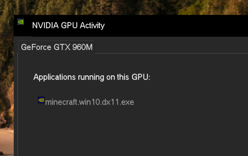
The culprit? Minecraft. Soon, I remembered something about UWP apps: they like to run in the background.
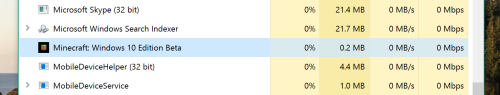
This was tough — I didn’t want my GPU turned on all the time, but Minecraft seemingly ran in the background without my control at random.
Eventually, I remembered a group of settings buried in the Windows 10 Settings app, the “Background apps” tab under the “Privacy” section. In hindsight, the menu for “Background apps” might logically control an app running in the background that I didn’t want. But since UWP apps are new, it’s not second nature to head to a section of the global settings app to control when a program runs. That’s a phone app paradigm adapted for desktop PCs, so I expect many people, no matter their technical literacy, to have trouble making this connection.
But here’s the thing: it doesn’t actually work.
While I’m sure turning off an app’s background privileges has some effect, even after a restart, Minecraft is still running in the background as shown above. Again, this wouldn’t normally matter, but because it causes my dedicated graphics card to turn on, it would have a massive impact on battery life if I hadn’t noticed.
Microsoft (or Nvidia) should find a way to handle this gracefully. Windows needs an elegant way to allow UWP games to run certain tasks in the background without activating dedicated graphics cards. In a normal Win32 application, a helper process would accomplish this, even if most users wouldn’t want MinecraftHelper.exe to run on startup. But I haven’t seen any UWP apps that use multiple processes that could be separately treated by graphics drivers.
I hope that an elegant solution to this issue emerges in the next few updates to Windows 10. For now, every mobile UWP gamer is stuck manually changing the graphics settings of each UWP application back and forth, every time they launch and quit.

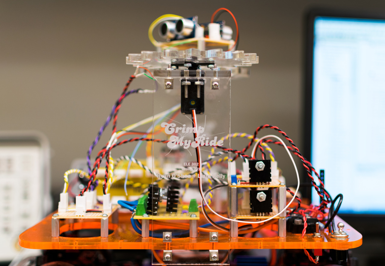
The last required course for electrical engineering majors at Princeton is ELE 302: Building Real Systems, affectionately known as Car Lab. Students partner up, take a stripped-down electric hobby car, and build the circuitry to drive it.
The first stage involves tearing out the RC controller for the motor and steering and replacing it with a microcontroller-driven power MOSFET, driving the motor at a constant speed using PID control. The goal is the make the car travel at 3 ft/s on any terrain. It needs to be within 2% of that speed over flat ground and 10% of that speed on an upward or downward incline.
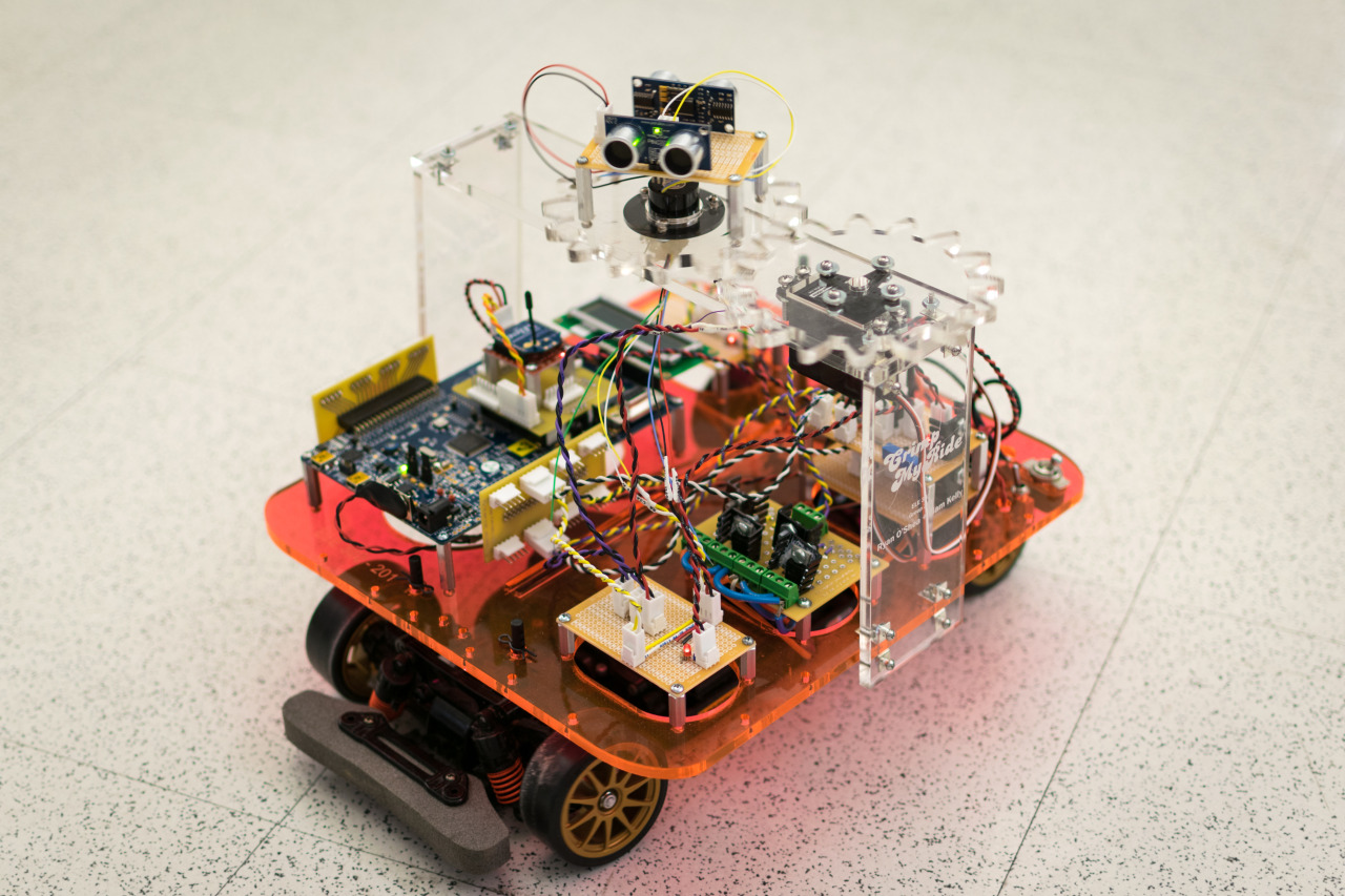
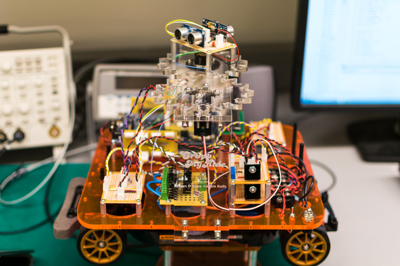
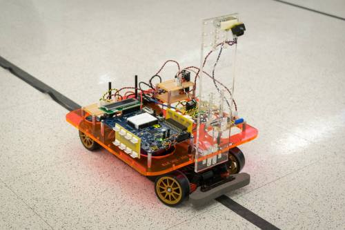
The next stage involves mounting a VGA camera to the front of the car, looking at the ground, programming the car to follow a black line on the floor at a fixed speed. The challenge here is parsing the video signal into a meaningful indicator of the car’s angle relative to the track. The version of the car with the camera mount is shown below.
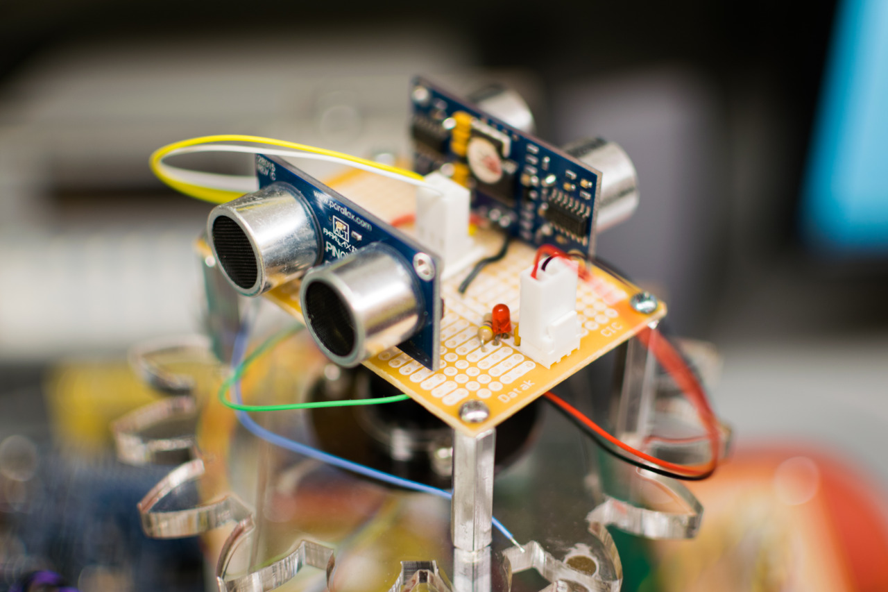
The last half of the semester is dedicated to a self-guided project. We decided to add obstacle avoidance capabilities to the car. We used two sonar rangefinders and a continuous-rotation servo to image the car’s immediate surroundings. The gear system we mounted the sonars to was a custom design that we laser-cut in acrylic. By having two sonars facing opposite directions, we could completely map the surroundings every half a rotation of the servo, or 100 times per minute. We used that information, tracking up to two obstacles at a time, to steer the car out of the way of obstacles. We also transmitted the car’s local surroundings map via a wireless serial link to a laptop, where we plotted it in Matlab (below).
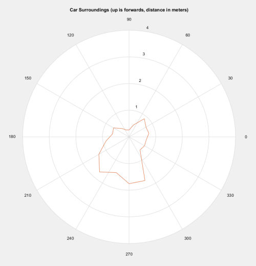
The result was a car that navigated the environment in a fairly unintelligent way, considering the minimal data it had to work with, but always managed to avoid obstacles as it drove. There’s video of it in action below.
Building PollPrinceton
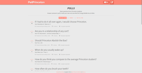
This past semester, I took a class taught by Brian Kernighan where everyone in the class built a large-scale programming project as part of a small team. The team that I led built a small, single-purpose social network designed to be used by Princeton students to ask questions to the university community. We built PollPrinceton.

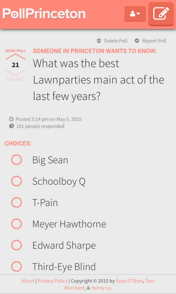
The idea behind PollPrinceton was to build an app like Yik Yak which students could use to ask quick questions quickly and easily. The site is authenticated using Princeton’s Central Authentication Service, so only current students and staff members can use the site. When they log in, they see a feed of polls asked by anyone with a Princeton ID.
If they want, they can anonymously ask a poll themselves.
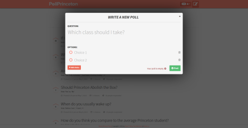
Or, they can participate in existing polls.
Oh yeah, and it’s totally responsive and mobile-optimized too.
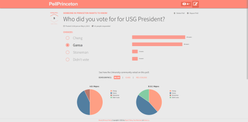
For polls that already have a few votes, you can view demographic breakdowns of the way people have already voted by degree program, class year, and residential college. We cross-reference data from the Princeton student facebook with the responses each poll receives to generate visualizations of the data.
Stack
I did a lot of the work planning and designing the architecture of the app, which we visualized below.
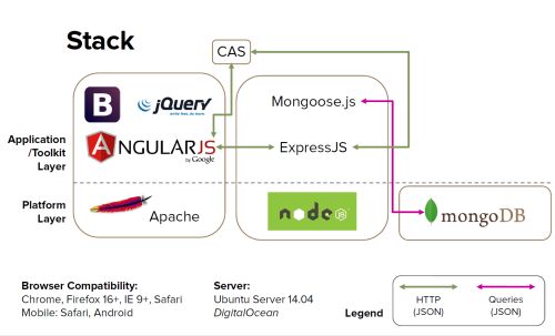
The frontend was an AngularJS app, drawing from my experience building an app for Comcast last summer. Bootstrap and jQuery helped build some of the interactive components. The backend was written using ExpressJS on top of Node.js, which we taught ourselves for this project. We stored everything in a MongoDB, using Mongoose.js to interface with it from the Node server.
There’s a much more in-depth write-up on the technology we used here.
Developing with this JavaScript/JSON-only stack was actually a joy. Spinning up the application was very simple, once I finished writing my own JavaScript integration for Princeton’s CAS service.
I expanded a bit on the frontend design process in a post over on Behance.

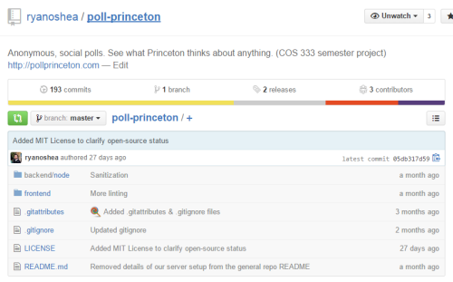
We open-sourced the entire project on GitHub from the start, which you can see here. We hosted it on an Ubuntu server provided by DigitalOcean.
If you want to see our spiffy splash page, or use the site if you’re a Princeton student, you can check it out at PollPrinceton.com.
The iPhone 6
Back in November, I upgraded to the iPhone 6 from my trusty old iPhone 4S. Because the most necessary thing I could do is provide yet another review of Apple’s new phone for the Internet’s collection, I decided to write down my thoughts on it. I’ve done so for much less significant device purchases before, and this phone has become the most important device in my life over the last few months.

Comparisons
I upgraded my 4S to iOS 8 when it was released. The 4S is the oldest phone supported by iOS 8, which generally means it’s a poor idea to update. I knew I was due for an upgrade, though, so I did it anyway. After about a month using my 3 year old device with a brand new iOS, upgrading to the iPhone 6 was like wearing glasses for the first time. It wasn’t just about speed, although the performance difference between the 6 and 4S is so hilariously large that using the 6 for just about anything felt great. The new features the appeared in those 3 years are an amazing upgrade as well:
- Touch ID sensor
- Health, the motion coprocessor, and barometer
- Apple Pay
- drastic upgrades to the cameras
- LTE
- 64-bit architecture
- drastically larger screen
Those are the ones that actually affect my day-to-day with the phone.
Here are some of the features I love from the iPhone:
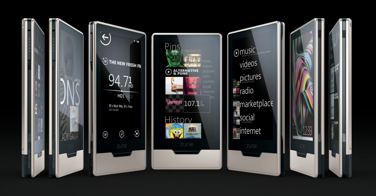


In the 2000s, the Microsoft Zune was one of the most frequently ridiculed products in the world. I’ve always found that funny, because the design (if not the market strength) was impeccable almost from the start. I can’t think of a single product line that so singly drove the design language of any major tech company as did Zune. Every major platform Microsoft produces now, including Windows, Xbox, and Windows Phone, has clear, deep roots in the Zune ecosystem’s design.
Not bad for a “failure.”
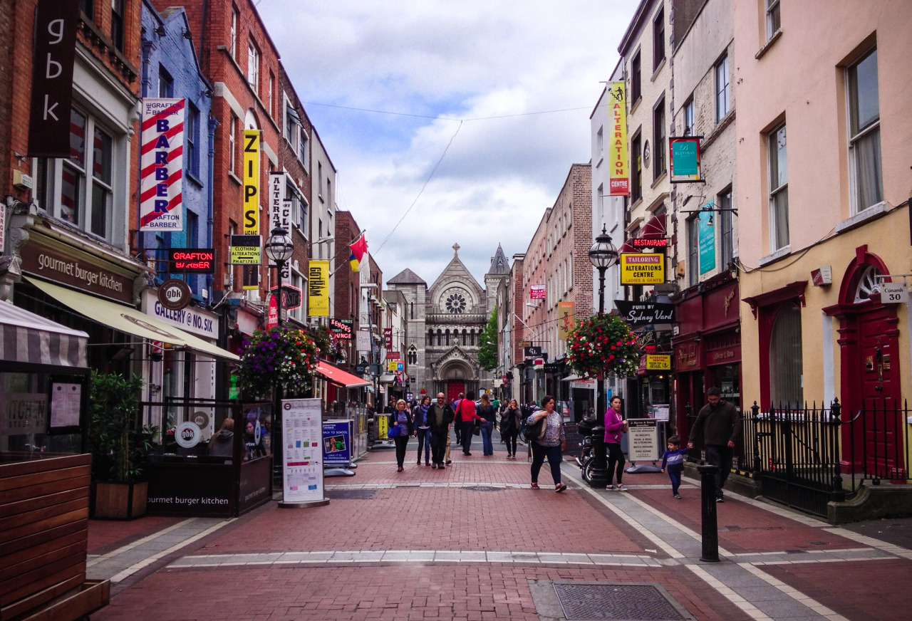
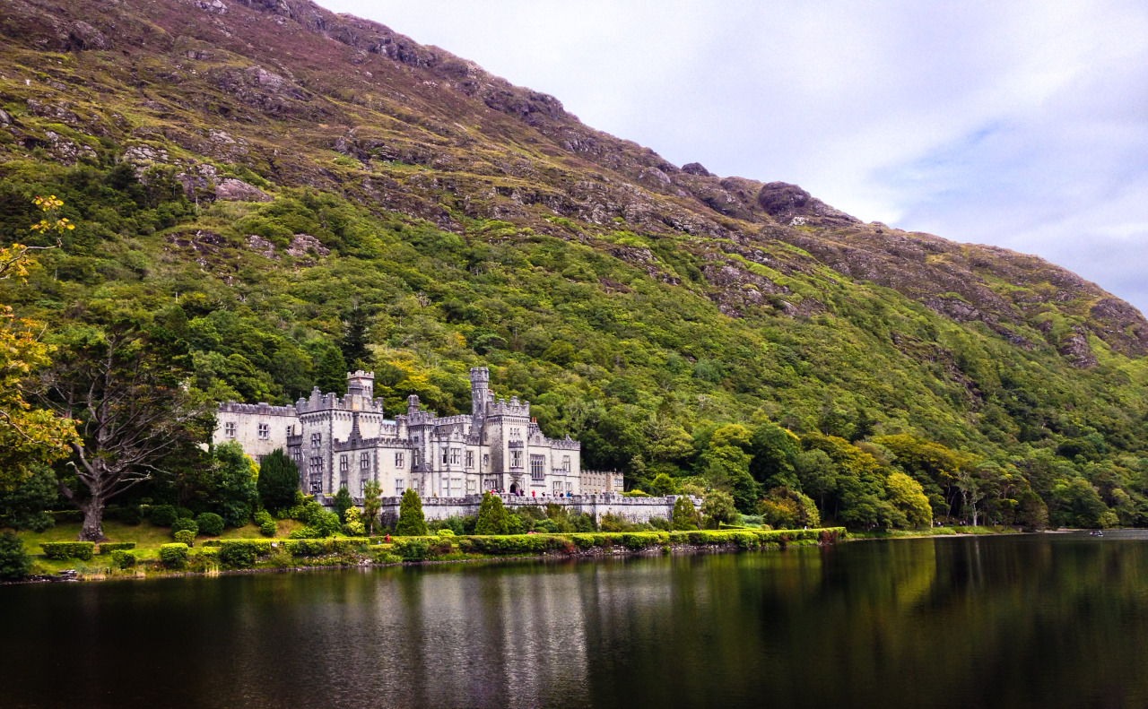
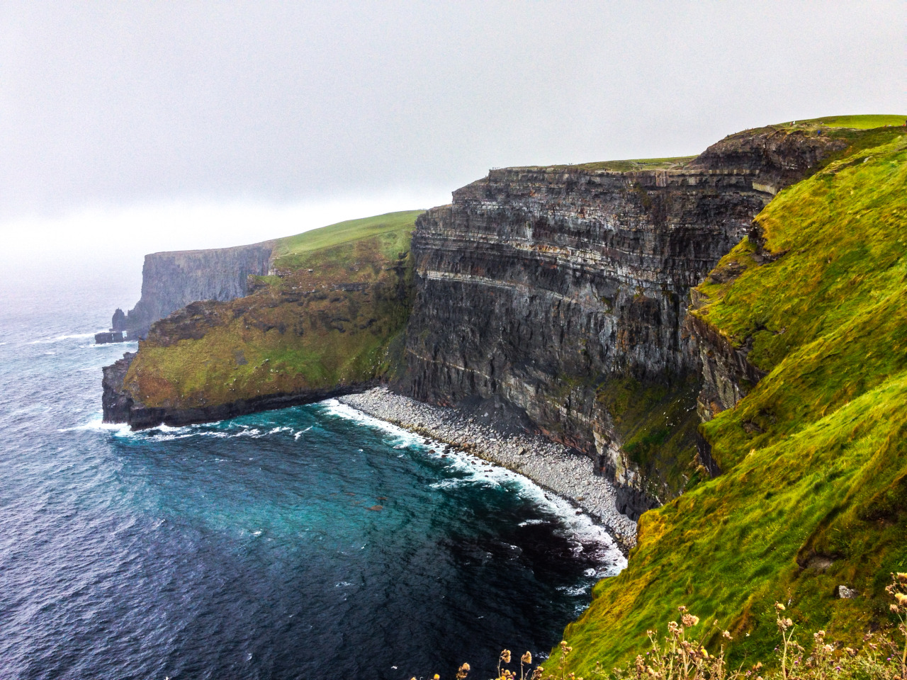
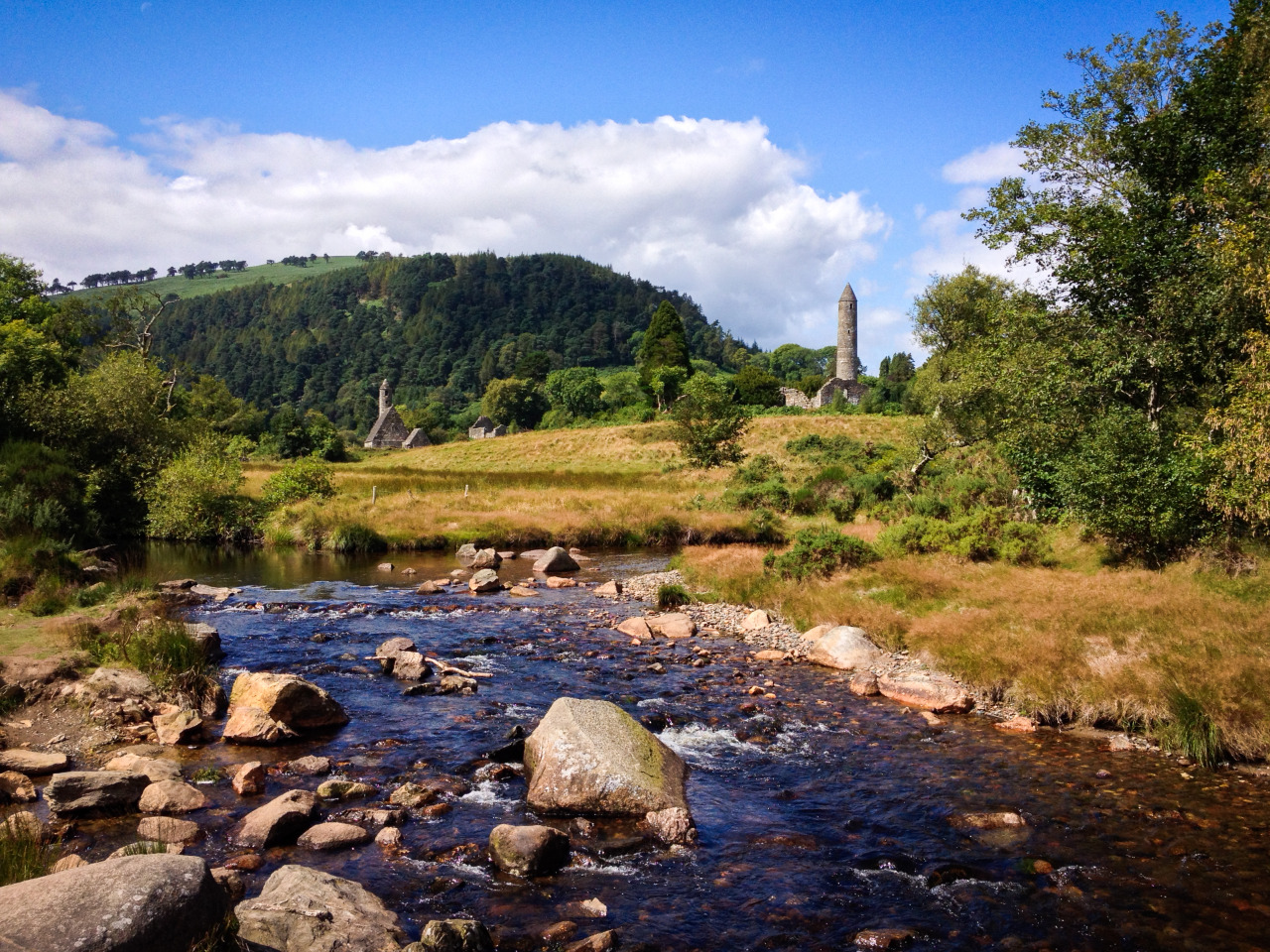
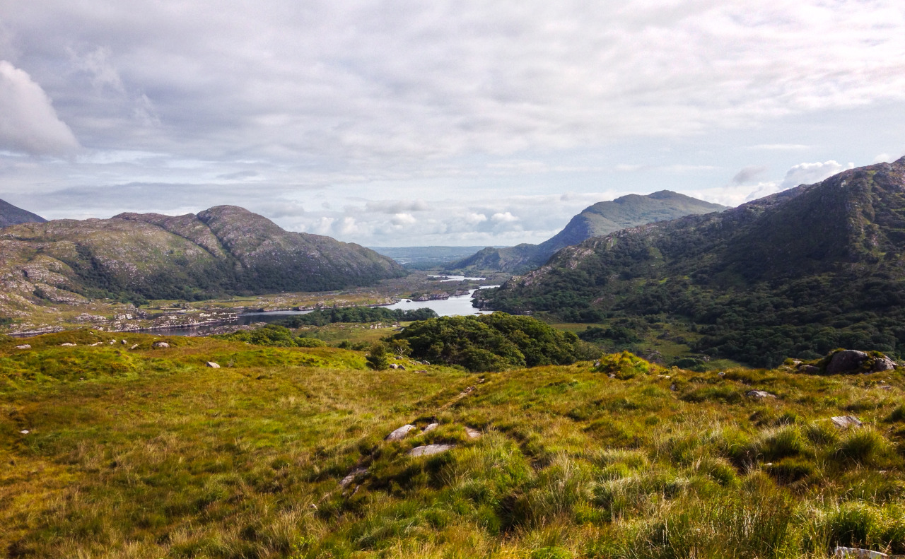
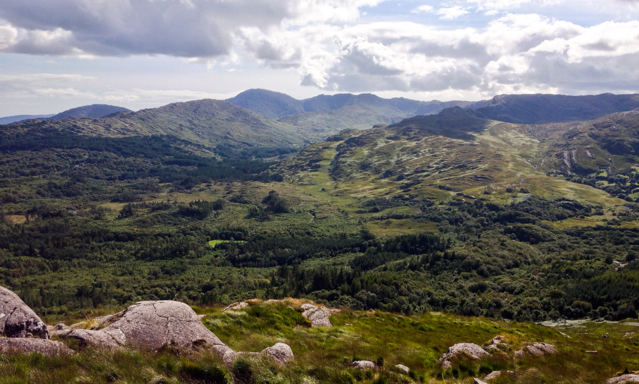
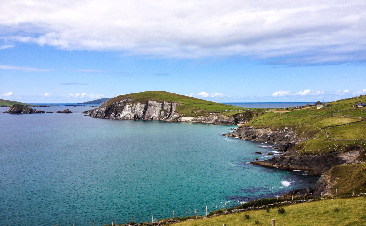
Photos from my family’s trip to Ireland
Taken on an iPhone 4S
My first week with Fitbit Flex
Last week, I decided to make a move on a decision I’d been debating for a while. I decided to get myself a fitness tracker.
I’ve always been a bit of a sucker for health metrics. I’m completely aware that gamifying parts of my life causes me to be a tad obsessive about them, but I feel that health is the one area where I could afford to be compulsively concentrating on improvement. I was a somewhat early adopter of Nike + iPod and continued using Nike+ to track my runs for six years. I’ve always felt that having my performance tracked gave me extra motivation to do better. In the last year, I’ve been using Sleep Cycle to keep track of my sleeping patterns.
So I decided to buy a Fitbit Flex.
Why I chose Fitbit Flex

Neither of these services were particularly intrusive or required much work on my part. Sleep tracking was a bit more intense than run tracking, because Sleep Cycle requires keeping my phone on my bed during sleep, but since both running and sleeping are activities with a definitive start and end, it wasn’t difficult to incorporate tracking into my routine.


Google’s new Material Design initiative is certainly promising. A coherent design across third party apps is something that Android has needed for a while. But Android has serious competition from the iOS ecosystem. iOS 7 has been out for less than a year, and already, almost all popular apps have adapted to the new design language and created their own designs that work well with the language of the new design. It will be interesting to see if Android’s ecosystem can step up to create an equally great end-to-end experience.
Here are some of the best-designed iOS 7 apps on my phone.