Beyond Red, White and Blue

Poster designs for political campaigns are usually laden with patriotic clichés — red, white and blue, stars, stripes, eagles — which given their turgid redundancy have a numbing rather than rousing effect.

The reason for this design rut is simple: conventional campaign imagery is usually produced by mainstream advertising agencies slavishly following old formulas lest they make a truly novel statement that might offend a single voter.

But now everyone is talking about the Social Realist inspired poster of Barack Obama by Los Angeles graphic designer and street artist Shepard Fairey, and how unique it is. In truth it’s not all that unique. Indeed, artists have been inspired by particular candidates for years and have designed posters that break the mold not only in terms of color and style but also in message and tone.

These posters are memorable because they reject bland tropes while making novel graphic statements that reflect the times in which their candidates are running. Mr. Fairey’s work appeals largely to young audiences, and this poster exudes a youthful cachet.

Since these artists’ designs have not gone through the routine vetting process, the image is unfettered by a canon and commands attention because of its freshness. Take a 1968 poster for Eugene McCarthy by Ben Shahn, rendered in his signature loose linear style. Instead of a ham-fisted patriotic message, it exudes an image of hope — of change.

Ben Shahn: Eugene McCarthy campaign poster, 1968
Ben Shahn’s signature loose linear style is captured in this 1968 Eugene McCarthy poster.

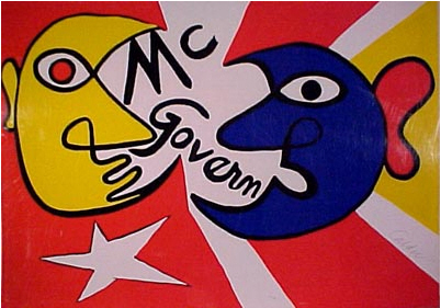
Or the poster that Andy Warhol produced in 1972: an impressionistic image, based on an official portrait of Richard Nixon under which Warhol roughly scrawled “Vote McGovern.” It was the height of irony in a campaign that later became known for its dirty tricks.

Andy Warhol: George McGovern campaign poster, 1972
Andy Warhol used an official portrait of Richard Nixon in this 1972 George McGovern poster.

In 1984, vice presidential candidate Geraldine Ferraro was depicted as Lady Liberty in a convincing send-up of Eugène Delacroix’s 1830 painting “Liberty Leading the People.” Parody of existing artworks is one of the easiest forms of graphic humor because it turns the table on recognizable images, forcing the viewer to have a double take, which impresses the picture in the mind.

Mondale-Ferraro campaign poster, 1984
A 1984 campaign poster depicting vice presidential candidate Geraldine Ferraro as Lady Liberty.

In 1996 Peter Max, who gave signed copies of his Statue of Liberty prints to whichever president was in office, created a poster for Bill Clinton and Al Gore’s re-election campaign. Mr. Max’s post-psychedelic poster was a welcome alternative to the tried-and true.

INSERT Clinton-Gore campaign poster, 1996
Peter Max’s post-psychedelic poster for Bill Clinton and Al Gore’s re-election campaign in 1996.

Breaking from tradition does not add votes to a candidate’s column, but alternative graphic approaches are decidedly more eye-catching and that can’t help but have a positive public impact. Sure, posters, banners and buttons are not going to sway a voter, but they may touch responsive chords with those who have already made choices.

During the McCarthy campaign I hung the Ben Shahn poster in my apartment window not just to show support for the candidate but to ally myself with my generation, which the poster’s artful graphics telegraphed so well. Likewise, the Obama poster is street art, which signals a message to youth culture. And even for older voters it signals change. At the very least it suggests that if campaign messages were not so formulaic there might not be the perception of business as usual.

Comments are no longer being accepted.

The color of campaign literature and party symbols has always interested me. One of the most striking things about Eugene McCarthy’s campaign — what made it totally different and appealing to young people, was the use of a bright green and white combination — so strikingly different from the traditional red white and blue. Seems tame now, perhaps, but it was radical then: it made a statement on its own. Speaking of colors and party symbols, can anyone explain why (as far as I can tell, living for many years now in Australia), the printed and electronic media in 2004 suddenly ‘switched,’ and the Democrats became blue, and the Republicans became red in the color codes for the maps and bar graphs. This was a complete reversal of tradition. I kept waiting for someone to explain why, but I’ve never even seen a comment about it. How come? The silence on it is positively Orwellian.

I don’t like it at all! Too reminiscent of the old Communist posters. All that’s missing is a hammer and sickle or “Workers of the World, Unite!”
Obama deserves something fresher than this,

Of the posters you offer up, I find the McCarthy Peace poster the most appealing. It’s the informal airiness, and something about the stripes and the lines of the dove that creates cheery interest.

Peter Max’s ’96 poster is more Warhol than Max. Warhol’s McGovern poster is, of course, Warhol. The Ferraro poster is effective, as you point out, in drawing you in, but it is too grave and melodramatic to communicate positive change.

Warhol, Max, Shahn Fairey (the only one to come to graphic design through street art, of the ones you mention)indeed take us into a new direction with campaign art, one that does bespeak change through the language of design, using the popular visual dialect of ‘street art’.

One additional angle Mr. Heller does not note is the Shepard Fairey is the artist behind the “OBEY” campaign which has plastered images of Andre the Giant on lamp posts and mailboxes coast-to-coast. Not only does this add to Sen. Obama’s youth credentials, it is an interesting emergence of a type of art closely aligned with graffiti as well as vandalism. That an artist, who started working in the counter-culture during the Clinton administration, would embrace something as mainstream as one of the Democratic Party’s leading presidential candidates indicates to me that this candidate has to be seen as fundamentally different to his competitor.

Another indication of Obama’s connection with the people is the body of street art and hand-made posters for the candidate. Some remind me of the street art seen in Mexico that attempt to replicate commercial advertising, but instead create something original and unique. Some are just straight-up spray-painted mural work. Other homegrown efforts are closer to the quality seen from Fairey’s studio. Some are effective, others less so, but they all come from the street, and from people who are very passionate about their candidate–and isn’t that a great thing for politics in our country today? Hooray non-apathy!

Campaign posters provide a living glimpse into the aesthetics of our attitudes towards politics. There are tons of them, official and handmade, that reveal where we’re coming from and perhaps where we’re going. Bumper stickers, too, and there are many, indicate with irony and some truth the state of the union. (Unfortunately times change and all those Bush/Cheney stickers are hard to dislodge!). Much has been made of the those little lawn signs that populated the suburbs in 2004, with Kerry/Edwards competing with Bush/Cheney all competing with the roses. Do they actually persuade people? Maybe. Perhaps it’s all just an aspect of our wallpapering obsession, regardless of our politics. However, as an artist, I’m now working on a number of political designs to show my distaste. I doubt, however, these works will do very much to change the political tenor in the country.

MR / //homepage.mac.com/mistahcoughdrop/

Let’s not overlook the wonderful series of posters Alexander Calder made for George McGovern in 1972.
Here’s one example–

//www.herndonfineart.com/images/Calder/calder_mcgovern_for_president.jpg

Mr. Heller’s appreciation for design is interesting at best; however, such is indicative of the intellectual collapse of our nation. The plight of America only worsens when voters are impressed with the candidates game-playing in their advertising—it’s merely akin to their marketing campaigns—all vacuous promises, not grounded in facts . Until we begin to ask the hard questions of any and all candidates, demanding they prove to us that they know the Constitution, Bill of Rights, and history of our nation, nothing will improve in America. Thus far, not once candidate has shown enough respect for our intellect to convince us of a viable “contestant” for office of President. I shudder to think who the vice-presidential candidates will be, come the Conventions.

The age-old saying, we deserve whom we elect, is driven home to us in every newspaper around the world. We are all equally to blame, with members of the House, Senate, and 1600 Pennsylvania Avenue, for errors committed in judgment, tolerating actions against the Constitution, overall lack of knowledge about the USA, its laws, and memory for our past. At this point after months of ennui with the candidates’ verbiage while “running” for the White House, not one has evidenced the qualifications needed to serve as president, thus, art in campaigns would be wonderful if it featured local artists in each public venue. Wake up, America.

Today You Tube creates our “posters”. But now they move and sing and really touch to the core.
The “YES WE CAN” piece on YOU Tube is for me the OBAMA
poster for this election.
Although unofficial, it will linger in the minds of all who watch it as the
poster that defined the election of 08.
That is of coarse if OBAMA gets the nod from the Democratic party.

There is another reason why it is incorrect to describe Shepard Fairey’s Obama poster as “unique.” By definition, prints exist as multiple impressions of a single matrix, thereby combating the uniqueness of many other forms of visual expression. Printmaking is an inherently democratic medium and practice, and its political potential has been recognized for centuries.

As an artist, I have some educated perspective on the subject. I viewed the Obama poster… it’s derived as all of the political posters’ imagery in your article from another source; borrowed, stirred with the candidate’s likeness to bring a response from the viewer it’s disignated for.

The Obama poster reminds me of old German 1930’s National Socialism posters… SCARY!!!!

Mr. Fairey’s poster of Barack Obama “exudes a youthful cache?” Not to me. It exudes an old-fashioned kind of “Workers of the World Unite” feeling. I’m reminded of woodcuts calling for revolution in Mexico that I recently saw at a local art gallery. I’m pretty far left politically, but the poster kind of scares me.

Most political campaigns portray zero personality. The candidates and their advisors are unable to see their visual brand as being about more than a pantsuit or a good haircut. I hope the campaign managers will read Mr. Heller’s piece and inject a little art and wit into their deadly dull, indistinguishable campaign materials. With all that money being spent on advertising, please put a little into good design!

The funny thing about the Nixon work by Warhol is that Warhol is known to mix colors. So it’s more of a Warhol style work of a smiling Nixon than a negative attack upon him.

Re Steven Heller’s article——–

The major factor in future elections is turnouts of blacks,latinos,and lower paid feemales; particularly in states such as Texas where those folks are the solid majority. It’s a matter of time, they will control most states in the country. The Old-Guard of the Republican Party need to step aside; and bring in new and smarter people.

Also, recognize that the Reagan and Bush years were the worst years of the National Debt. Under Reagan, it almost tripled. The old conservative base of the party doesn’t even realize how bad it was during this time period. Voters are finally beginning to get smarter. That’s the reason Obama is carring votes from so many college graduates. They’re getting smarter.

It’s unfortunate that the Republican Party hasn’t yet got the message. They need a better plan on the allocation of personal income taxes,health insurance costs allocation, streamling insurance companies, lack of government check-points, overseas corporations, and energy companies. Those entities have gotton out of hand. We don’t like too many regulations; however, we sometimes have to intervenes when crooks are ripping off the American people.

Interesting article, but I would have liked if you had shown the Obama poster that inspired the piece. I get that the NYT endorsed Clinton, but it would still be nice if factual info was included.

What a wonderful collection of images! Thank you. I would never have known about that image of Obama had I not read this.

Okay, niceties done with–let’s get into the art history of this. Nixon: hardly an impressionistic image. When you give someone a green face and yellow lips, that would fall into expressionistic. Think Munch, not Manet.

Calling the image of Obama inspired by Social Realism is a stretch. Ben Shahn, who was a social realist, now his image is a Social Realist kinda thing. It has that folksiness that you’d expect from Social Realism. The Obama image may look Socialist–yes, it does look like Socialist / Fascist art. However, it’s way too technological looking to be related to Social Realism.

And I did bristle when I read the figure of Liberty, or rather, Marianne, being called Lady Liberty. But I’m willing to give you that. But really, Lady Liberty is that gal who passively stands (even as she beckons) in the New York Harbor. This is LIBERTY–she’s climbing over dead folk–she’s no lady. And, she’s Marianne, the French personification of Liberty. But, I guess this one can get a pass….

Regarding Mr. Corcoran’s question about the recent identification of predominantly Republican states with red and Democratic states with blue, I’ve wondered if the political mapmaker who started it wasn’t making a wry jab at the Republicans with the long traditional association of red with Communism and its “fellow travelers?”

So interesting that anything that deviates one iota from the norm is considered revolutionary or avant-garde. Personally, I think we need more of this kind of mental floss to shake things up. It makes me want to… oh, I don’t know, maybe have a glass of red wine with chicken? Yeah, I know, I’m crazy that way.

I love the poster design even if it borrows its style from the Russian Revolution artists who lionized Lenin and Marx. This graphic look was also popular during the WPA era in the 1930s and symbolizes change and prosperity as well as working together. It was used again in the 1960s in protest posters against the Vietnam War. I also see some of the Cuban posters of the 60s and 70s in this design. Above all it shows that this is a movement more than a campaign.

Just this morning, before reading this article, I wrote the following with no place for it in mind:

“I wonder how, in media representations, red, the color of communism, traveled across the spectrum to become a fascist hue, while blue, the color of the elite (or at least their blood), descended to the realm of the working man.”

This slightly exaggerated thought is not different from the previous entries; I include it to show that perhaps it’s a common question in this particularly political time.

Numerous political (including presidential) posters have been print outside the R/W/B motif. Numerous black and white, sepia tone and colorful posters, as well as mini-posters (buttons and postcards) have been printed over the years. You are not breaking tradition utilizing color, but trying to promote your candidate via the use of color especially over the R/W/B candidates’ posters. McGovern utilized many colors, Carter was mostly green/black/white. In New Hampshire’s January primary this year blue was the main background for the candidates. Huckabee posters name was in yellow and stood out much better than the others, especially at intersections where almost every candidate had a poster. It didn’t help him much, but then again, he wasn’t expected to do well. Buttons and postcards utilize many colors. Probably the finest and most highly desireable by collectors were manufactured during the 1904, 1908 and 1912 presidential campaigns.

#17 – Like so many Obama supporters you are not paying attention. All you had to do to see the poster was click the link in the article.

Etienne Périer, in Paris, created a poster with some similarity to Shepard Fairey’s poster in this column. Please take a look – what do you think?

Etienne created the poster for the Paris Obama Meetup, but gave kind permission for its use by the London Obama Meetup, changing the text a bit.

I apologize – this isn’t a ruse to get people to join the Obama London Meetup. But you need to join the group to see the files. Please join, then quit immediately after you see this.

Thanks!

//files.meetup.com/406908/9%20%20%20Flyer%20-%20Feb%206%20Meetup%21%20%28color%29%20-%20by%20Etienne%20P%E9rier.jpg

Carole Bell
//www.Americans-Away-From-Home.com