I love this illustration by Nick Sheehy aka Showchicken. There are lots more exceptional, but more surreal, drawings over on his site. Pilfered from Tobias Hall, thanks.
I’ve wanted to feature the work of Blake Wright for a while now but have been unsure how appropriate his work is for this blog, but after his recent updates I don’t feel I can put it off any longer. The subjects to his work are usually either fashion (especially shoes) or gay culture but every illustration is riddled with Wright’s brilliantly irreverent sense of humour. His style is so casual that it could sometimes be construed as simply bad, but it fits perfectly with the humour in the images. A lot of his work is NSFW and if you aren’t a fan of nob drawings, or at the very least you don’t find them funny, don’t bother visiting his site.
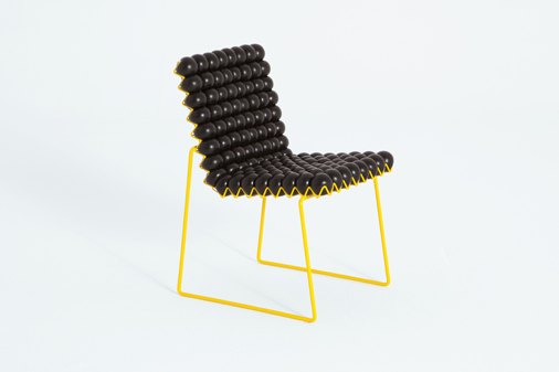
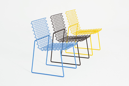
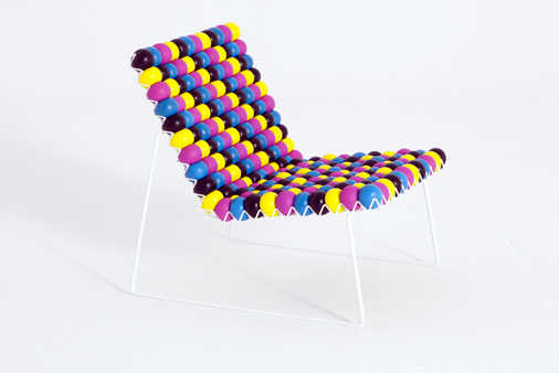
Trybek is a graphic designer and art director who has now, very successfully, diversified into product and furniture design. His ‘AntiStress’ chairs look just as great when they are a bare wire frame as when they’re covered with brightly coloured stress balls (which are used as padding), albeit not as comfortable I am sure.
I love both the style and craft of Dutch illustrator, Raymond Lemstra‘s work. His ‘About’ section on his site is also very enlightening, giving a real insight into not just him but how he goes about his work and why.
Here is a very nice collection of some of Philip Castle’s non-commercial illustrations. Castle is best known for the work he did for the Stanley Kubrik films A Clockwork Orange and Full Metal Jacket, but his more abstract and satirical illustrations are by far my favourite.
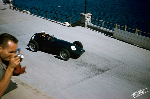
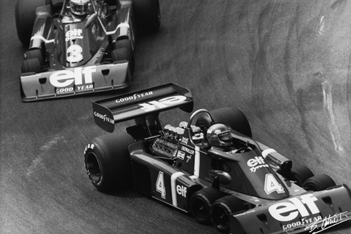
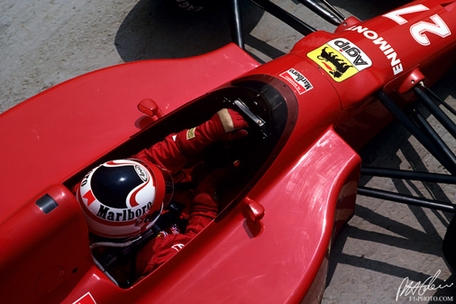
The Cahier Archive is a collection of extremely good Grand Prix related images. Ranging right back to 1951, it is surprising to see so many images that aren’t familiar even to an F1 fan.
What’s also great are the few pictures of the Tyrrell P34 which, surely, has got to be Six’s favourite racing car.
Lord Dunsby is the pseudonym of illustrator Steven Millington. His illustrations are ace, he has a very distinct retro style that lends itself perfectly to illustrations of Emma Peel. Despite having depictions of my favourite Avengers character in is portfolio, I actually prefer his brilliant decorative hand-drawn type.
Silhouette Masterpiece Theatre might not be the most modest of names for a set of illustrations but it is doubtlessly fitting. Wilhelm Staehle clearly has a brilliant sense of humour, not only are the postcard illustrations very funny, but even his bio will make you chuckle.
via ONEEIGHTNINE
I love the attention to detail in this map by Abigail Daker, I assume that it must be huge and she must have an unbelievable amount of patience. For more illustrated map goodness, check out this great one of Reykjavik’s centre.
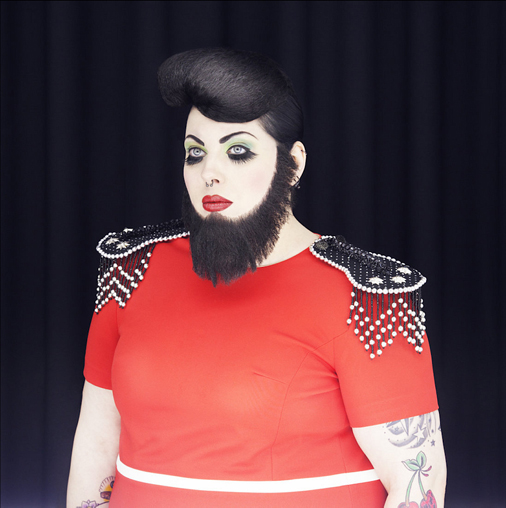
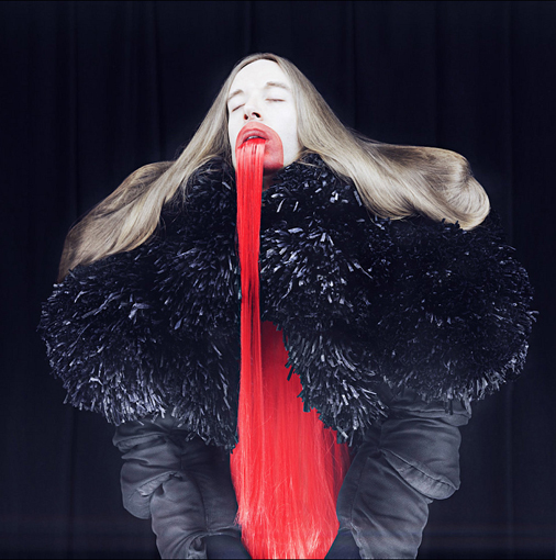
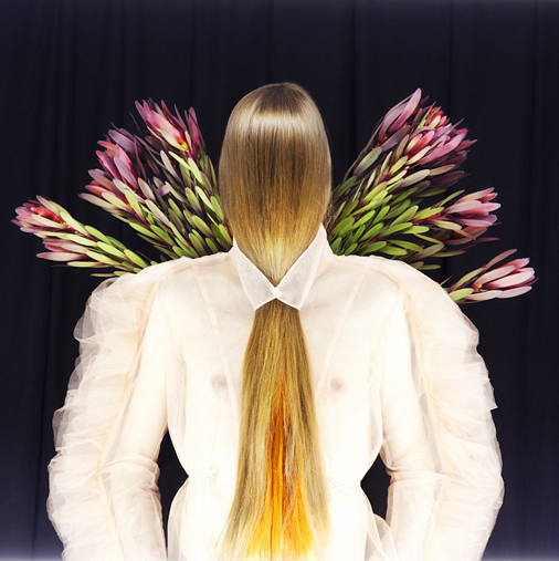
Madame Peripetie is a Polish photographer based in Germany. I believe her name translates as Mrs. Unexpected and unexpected is certainly the feeling you get when looking at her beautiful images.
She explores the boundaries between fashion, sculpture and the human body, experimenting with various fabrics and patterns; whilst infusing high-fashion elements with abstract and conceptual ideas, creating an eccentric escapade of color and texture. In her work she is focusing mainly on the interaction between body, language and new media. Her inspirations include surrealism, dadaism as well as the new wave era of the 80s, British post punk scene and the avantgarde theater of Robert Wilson.
The images shown here are taken from a set titled ‘Dream sequence’.
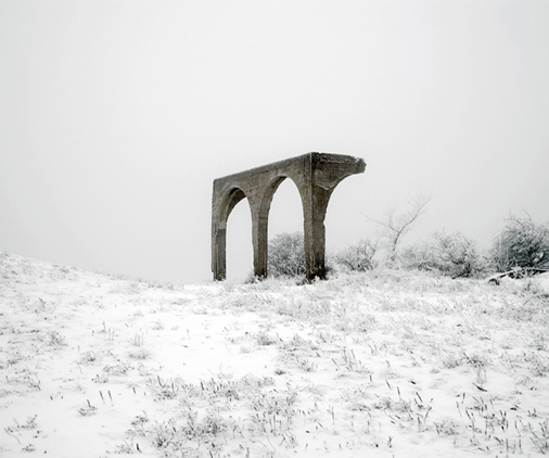
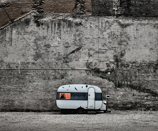
Tamas Dezso is a documentary fine art photographer working on long-term projects focusing on the margins of society in Hungary, Romania and in other parts of Eastern Europe. His photographs have been published in TIME, The New York Times, National Geographic, GEO, Le Monde Magazine, Ojo de Pez, Polka Magazine and many others. Check out his latest work here. More of Tamas’s past work can still be viewed on his old website.
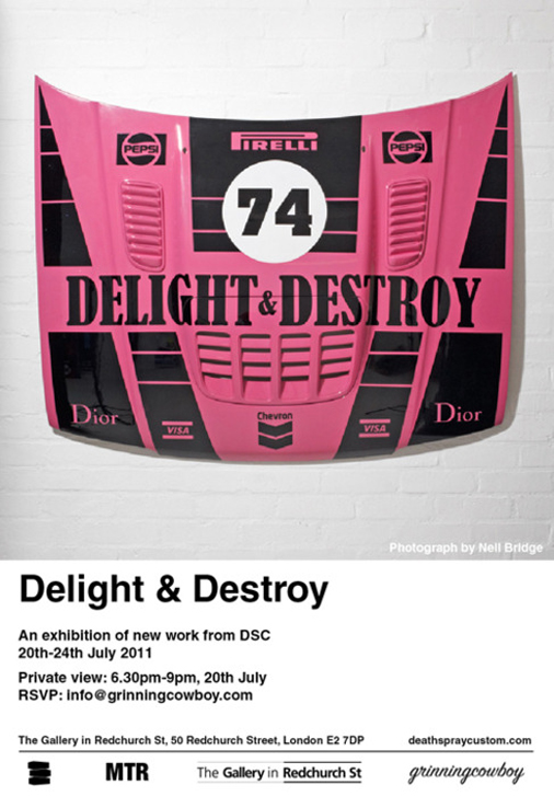
Lust, power and consumption are the themes behind DSCs latest body of work. An alternate world has been created where consumer brands are laid bare with a message that could be speaking from their collective subconsciousness. This is communicated by vivid urethane paint on steel and aluminum performance car bonnets. These represent racing car teams without the veneer of pretence, a world where brands, money, consumption and power feed off each other and consumers. The results are striking, high gloss panels that appear almost as lustful totems to modern society.
Death Spray Custom‘s latest solo show, Delight & Destroy, looks and sounds like one not to miss. Their approach to custom spraying is refreshingly original; a heavy dose of wit and irony aren’t seen frequently enough in car and bike customs or motor-sport.
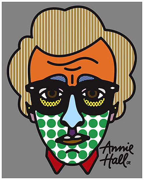
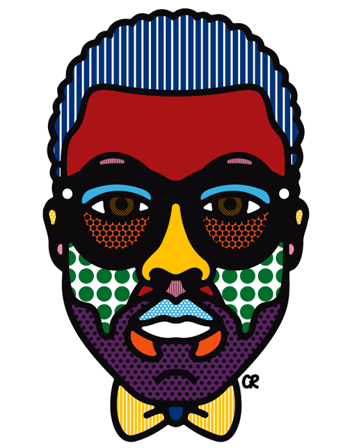
Craig Redman and Karl Maier live on opposite sides of the world but collaborate daily to create bold work that is filled with simple messages executed in a thoughtful and often humorous way. They specialize in illustration, installation, typography, as well as character, editorial and pattern design. Craig recently contributed the above image of Woody Allen for the Little White Lies exhibition LWL70, which until recently, showed at Kemistry Gallery.
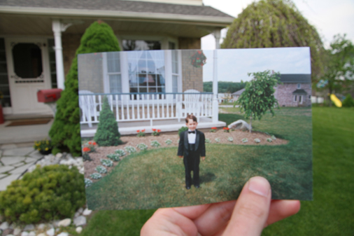
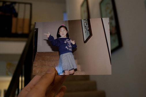
Dear Photograph is a really nice idea; I hope it takes off and there becomes a huge collection of these nostalgic images from all over the world.
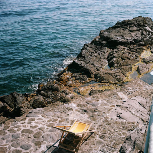
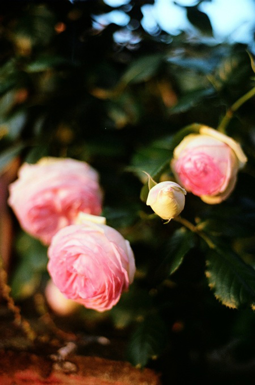
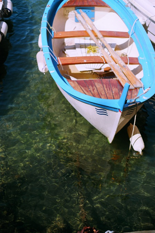
Brian W Ferry may not be the Brian Ferry of Roxy Music fame, but once you have had a peek through his portfolio you will probably have a similar amount of admiration for him. I particularly love his ‘Notes On Italy’ series on his blog, The Blue Hour. It has made me want destroy my DSLR, replace it with a trusty film camera and run off to Italy.
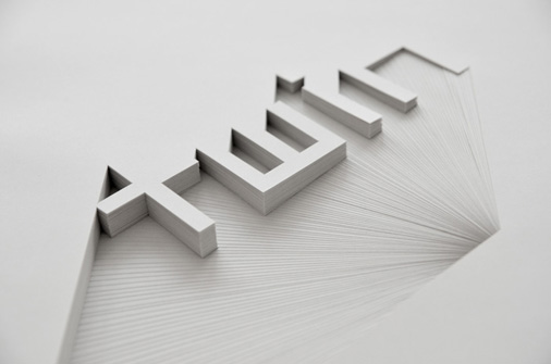
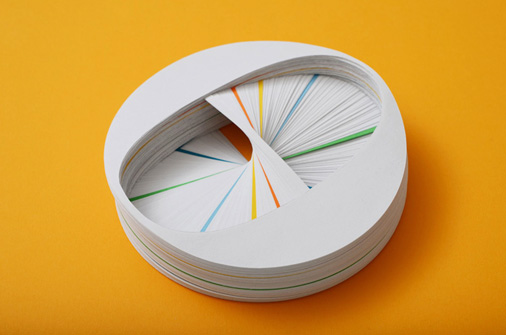
Bianca Chang is a freelance designer and part-time paper artist.
Inspired by the subtlety of tone on tone signage and the shadow-play of 3 dimensional letterforms Chang recreates this effect with paper which she describes as “a material so beautifully tactile and simple yet often mindlessly discarded”.
The time invested in each piece gives a sense of permanence to the material. The works are created by hand-plotting and multiple sheets of 80gsm 100% post consumer waste recycled paper – minimizing the impact of paper consumption and consciously transforming a typically disposable medium into a long term piece of art.
Impressive.
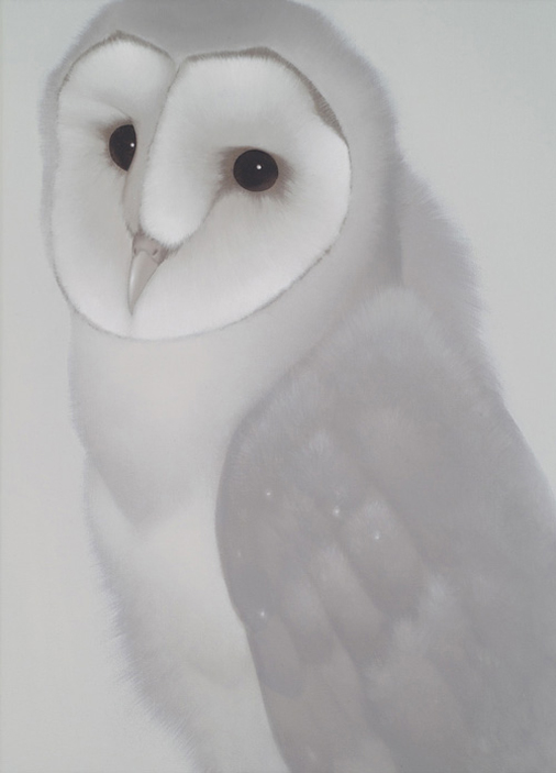
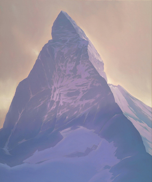
These paintings by Peter Vos look so soft and etherial. Who would have thought such a distinct style, like Vos’s, could work just as well for a painting of and owl as it does for a mountain?
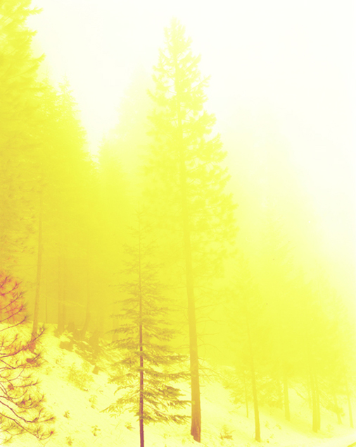
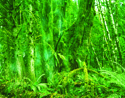
I have no idea how David Benjamin Sherry gets colours like this into photography but as all his images are ‘traditional analog prints’ I think it’s safe to assume it’s not with the help of Photoshop.
I have been fascinated with the rest of his work too, not just because of the quality but also because, from the subjects of the photos to the names of his work, it is mesmerisingly obscure. Also, watch out for the picture of the different coloured fruit; it’s a bit NSFW.
Great compositions, tremndous skill and a distinct style, it is therefore no surprise that Ricardo Fumanal is doing so well.


