Thanks

3 Comments

Goodbye 2012 and goodbye blog.

I said it would happen, and now it’s really here: this is my last post as DIY Dilettante. This doesn’t mean that I’m not busy dreaming up more career ideas–dog musher, website developer, and sunglass designer have all been recent interests–it’s just that I’m too busy trying to make a few of them reality.

You may have noticed that, even with some variety of career fields, there have been prevalent themes. Poet, Irish writer, bookseller, novelist–they’re all facets of the same desire to make writing even more central in my life. Between adding a few freelance copywriting gigs, storyboarding my first children’s book, and finishing chapters 2-20 of my novel, 2013 is sure to be a year full of writing.

Which is, alas, why I no longer have writing energy left for this blog. I love it dearly, will miss it dearly, and am so glad that some of you have enjoyed it as much as I have. Thank you, thank you, thank you. And Happy New Year.

Here’s an excerpt of WordPress’s 2012 report for my blog:

19,000 people fit into the new Barclays Center to see Jay-Z perform. This blog was viewed about 150,000 times in 2012. If it were a concert at the Barclays Center, it would take about 8 sold-out performances for that many people to see it.

Click here to see the complete report.

Minnesota politics: Say no to negativity

Leave a comment

I had planned this post a few weeks ago when I started the Minnesota theme, but I must admit it was a bit of a gamble. I had no idea whether I would be proud of what Minnesotans would vote for on election day or not. And there was a lot at stake.

Now, you might be scratching your head a bit. Minnesota has been in recent political news primarily from Republican presidential candidates Michele “Queen of Rage” Bachmann and Tim “Blandington J. Vanillaman” Pawlenty (and while we’re speaking of nicknames, we also had Jesse “The Body” Ventura as Governor from 1999-2003…oops). But Minnesota also has had the longest blue streak voting for president, due to the distinction of being the only state to vote for homeboy Walter Mondale in 1984. Even though Minnesota was mentioned as a swing state in this election, it never really seemed possible that Romney would win here.

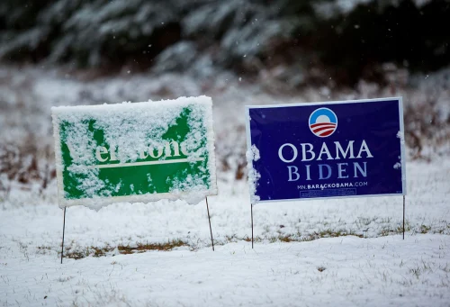
Because in my state, 10 years after the tragic death of our beloved progressive senator, neighbors still put out their green Wellstone signs year after year. Paul Wellstone was elected to the senate in 1990 after being outspent at a 7-1 margin by incumbent Rudy Boschwitz. I was 4 years old then; it was over my high school PA system that his death was announced just 11 days before he would have been reelected to his 3rd term in the senate. So, for most of my childhood, I thought that the job of a politician was to do what Wellstone did: work for peace, healthcare, and the environment. He was an activist for anyone not in a position to otherwise have their voice heard–immigrants, the poor, those with mental illnesses. In short, Wellstone made me naive about politicians.

However amazing Wellstone was, he did have his faults. For instance, by 2001, he admitted he’d made a mistake by voting in favor of the Defense of Marriage Act. If Wellstone were alive today, I can only imagine he would have ultimately championed gay rights, recognizing that as the next important battle for equality.

Though Wellstone is gone, the ideals of equality and fairness are just as strong with the citizens of Minnesota. This past Tuesday we had two constitutional amendments on the ballot: one to limit marriage to man+woman and one to require ID to vote. That’s not Minnesota nice. So we voted no. Nothing makes me prouder of my state.


Unfortunately, Michele Bachmann was reelected by outspending opponent Jim Graves 20-1, but the race was much tighter than anyone would have predicted. The good news is that the Governor, state house of representatives, and state senate are all democratic, so it’s quite possible that gay marriage actually will pass in the next two years here. That would be even more exciting than just shooting down a bigoted amendment.

Yeah, I’m pretty proud of Minnesota–there’s a lot to love here. Even Slate says you should move to Minneapolis. Not convinced by my past few posts? Watch Minneapolis mayor RT Rybak and his mom crowd surfing upon the news that Obama was reelected: Checkmate.


Minnesota music: Hot cheetos and kidneys

Leave a comment

Earlier this week, Minnesota had the rare distinction of having some of the best weather in the country. Those who are not from Minnesota seem to have only one concept of the state: that it is in a perpetual state of winter. And this, I’ll admit, makes me a little sad for my state. Because, in truth, we have gorgeous seasons, and in summertime it gets hot. Like seriously hot.

The hottest anthem of this past summer, already feeling like a distance memory, is yet another source of Minnesota pride. (Nice transition, right?) If you haven’t heard Hot Cheetos and Takis yet, you’re welcome:

These North Minneapolis kids created this song and video as part of a YMCA camp. And their whole album is amazing. It just makes your heart smile, no?

You might be surprised to learn that kids in the Twin Cities have plenty of local hip-hop idols to turn to, from Brother Ali to master beat-boxer Carnage to my favorites, Doomtree, a seven-piece group (I’ve written about Dessa before, the sole–amazing–female in the group):

The guy who raps first in that video, POS, released a new album just last week. Sadly, the release was somewhat overshadowed by POS’s announcement that he would be canceling the release tour on account of needing a kidney transplant ASAP. Immediately, support came rolling in. His friends set up a donation site, pointing out that he’ll have lifelong prescription costs and “rappers don’t have robust benefit packages.” They asked for $25,000 to pay for the transplant and follow-up costs, and gave themselves 120 days to raise it.

It took about 5 days. As of today, just a week after the site launched, 767 people have donated for a total of $33,116. Several have told POS seriously that if they’re a match, they will donate a kidney of their own as well. And if that doesn’t make your heart smile, I don’t know what would.

Minnesota sports: get a Kluwe

Leave a comment

Wild-Vikings-Wolves-Twins-Gophers

I have always been proud that Minnesota has a team for just about every major sport: the basketballing Timberwolves, the hockey-pucking Wild, the home-run-hitting Twins, the minor-league-home-run-hitting Saints, even the lacrossing Swarm (what verb is associated with lacrosse?). Arguably our best team, the lady Lynxes, just narrowly lost the WNBA championship two days ago.

The one team I follow closely, though, is our football team, the Minnesota Vikings. There’s much to be proud of this season, a year that was supposed to be dedicated to “rebuilding” (read: sucking). Everyone but the players themselves is completely surprised that the Vikings are now 5-2, and I would guess even a few of the players are surprised.

But it’s not just successes on the field that have brought the Vikings extra attention or made me proud to be a fan recently. About two months ago, Maryland state delegate Emmett C. Burns Jr. wrote to the owner of the Baltimore Ravens to discourage the Ravens linebacker Brendon Ayanbadejo from his open support of gay marriage. Vikings punter Chris Kluwe published a letter in response that is more than just strongly-worded in its takedown of Mr. Burns. It is so colorful, in fact, that it immediately went viral, and prompted many who know nothing about football to proclaim themselves fans of whatever side Chris plays for (no pun intended…or was it?)

Chris Kluwe: activist, punter, Guitar Hero

Kluwe puts his money–and his time–where his mouth is. This year in Minnesota we will be voting on a shameful proposed amendment to the state constitution that would declare marriage to be solely between a man and a woman. Kluwe has become the celebrity face of Minnesotans United for All Families, the chief opponents of the amendment. He has written to several legislators in the state who support the amendment to request a debate; none have responded.

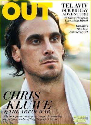
He hopes ultimately to change the culture of professional sports, so that an active player may someday soon be able to come out as gay and still find a place for himself in the traditionally homophobic arena of the locker room. Kluwe explains as much in his recent profiles in the New York Times, Out Magazine, and our own local paper, City Pages.

But Chris Kluwe is not defined himself by any one label; just read his weekly blog at the St. Paul Pioneer Press. His latest post is about the meaningless of currency. He also quotes scripture to disagree with a Catholic Archbishop, supplies campaign reform solutions, and talks about the psychology of losing. Oh, and he’s hilarious.

So even though Chris Kluwe is originally from California, I’m gonna claim him as a shining beacon of Minnesota awesomeness. Go sports!

How to be Minnesotan

Leave a comment

What you’ll need: flannel, hair binders (NOT hair ties)

Songlist: Duluth by Mason Jennings, Rock ‘n’ Roll Is Alive (and It Lives In Minneapolis) by Prince

Further reading: Lake Wobegon Days by Garrison Keillor, The St. Paul Stories by F. Scott Fitzgerald

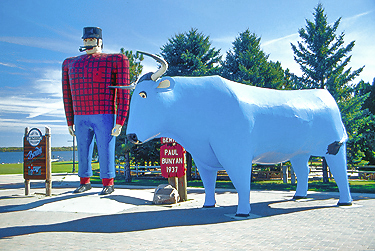
Proud Minnesotan Paul Bunyan and his giant blue ox, Babe

It’s been a long 8 weeks since I last posted. I wanted to write about Paris. I failed. There were too many things to say. And then, like that poor duck Ping who gets off the duck boat and decides it’s better to stay in the scary world than be the last one back on the boat, thereby getting whacked on the bum, I didn’t get back to posting (seriously, that childhood story has had a serious impact on my psyche). But you know what? Ping was wrong, and so was I. It’s better to get on the duck boat where everything makes sense and you’re warm and fed even if it hurts a little to admit that you failed.

There’s only one problem: I’ve pretty much run out of topics. Almost every Monday I think of a job that somehow relates to my current situation and realize I’ve already written about it. Everything except pirates (which, for the record, I did once think would be pretty cool). And so, though I thought I’d coast through to the end of 2012 with careers galore, I’m announcing the premature end of this blog. But don’t despair! I’ve got one topic left, and it’s a doozy.

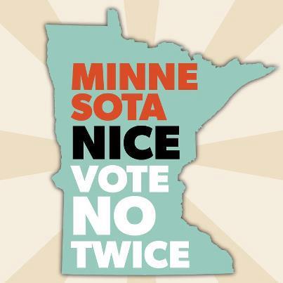
Okay, so being Minnesotan isn’t exactly a job, but it is pretty awesome. I’ve been exceedingly proud of my home state recently, and over the next week or so I’ll tell you a few reasons why. With the state and the Twin Cities consistently ranking in the top 10 for whatever top-10 poll you could think of (literacy, hipsterism, livability, prettiness), I won’t be able to cover all the ways in which Minnesota totally rocks, but I’ll do my best.

We do things a little differently in Minnesota. We play Duck, Duck, Gray Duck here. We wear hair binders. Some people think we talk funny. Dang it if we don’t make the meanest hot-dishes and jello salads this side of the Mississippi. (Trick statement: since the Mississippi starts in the smack-dab center of Minnesota, we’re every side of the Mississippi! Boom!) And we’ve got the nicest state motto around. No, seriously. It’s “Minnesota Nice.”

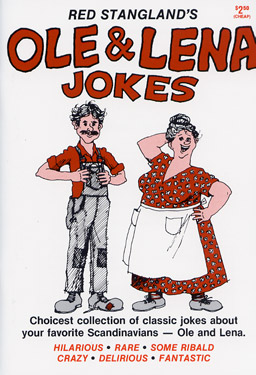
So, just because I’m so nice, I’ll end today’s post with a little joke. A yoke, if you will:

Ole died. So Lena went to the local paper to put a notice in the obituaries. The gentleman at the counter, after offering his condolences, asked Lena what she would like to say about Ole.

Lena replied, “You yust put ‘Ole died.'”

The gentleman, somewhat perplexed, said, “That’s it? Just ‘Ole died?’ Surely, there must be something more you’d like to say about Ole. If its money you’re concerned about, the first five words are free. We must say something more.”

So Lena pondered for a few minutes and finally said, “O.K. You put ‘Ole died. Boat for sale.'”

Good ol’ Ole

How to be a Parisian

Leave a comment

What you’ll need: a baguette, a beret

Songlist: April in Paris or any of these

Further reading: A Moveable Feast…or any of these.

Everyone has their own Paris.

My parents will be going to Paris in a few weeks, and everyone has advice for them. You must see this! You must eat here! You must! You must! You must!

Paris is the most-visited city in the world, and thus it’s not surprising that so many of their friends have visited, revisited, and made lists for themselves and acquaintances of what must be done in the City of Lights. But, of course, all this is a testament to the fact that you can’t go wrong in Paris. While those of us who have visited only a few times would recommend the few places we’ve been to, those who have lived in the city know that there is no one view of Paris. Each story written on the city is unique. We may think that the city itself is the story, but that is an illusion; Paris is impervious.

And so too, I think, are its inhabitants. How else could you deal with the influx of tourists, the requisition of so many public spaces for photo-ops and souvenir sellers?

This past April I flew to Paris to meet up with a friend studying in Fontainebleau, a town just 45 minutes to the south. I ended up spending only about 5 hours in the city itself. I’d been to Paris twice previously, spending about a week both times. I’d seen the Mona Lisa, the Eiffel Tower, Moulin Rouge, even the Catacombs. So this time I planned visits to the Palais Garnier, the Marais district, and Notre Dame, which I’d only seen from the outside.

When I got back to Fontainebleau I flipped through a book of photographs of Paris from the air. I was amazed then to see so many gorgeous sights–French gardens, museums, palaces–that I’d never seen, never even considered visiting. I understood then that you could spend a lifetime walking the streets of Paris and never see everything.

Do you appreciate it if you’re Parisian? Do you notice that everything you pass by would be the most-visited tourist site in any other city?

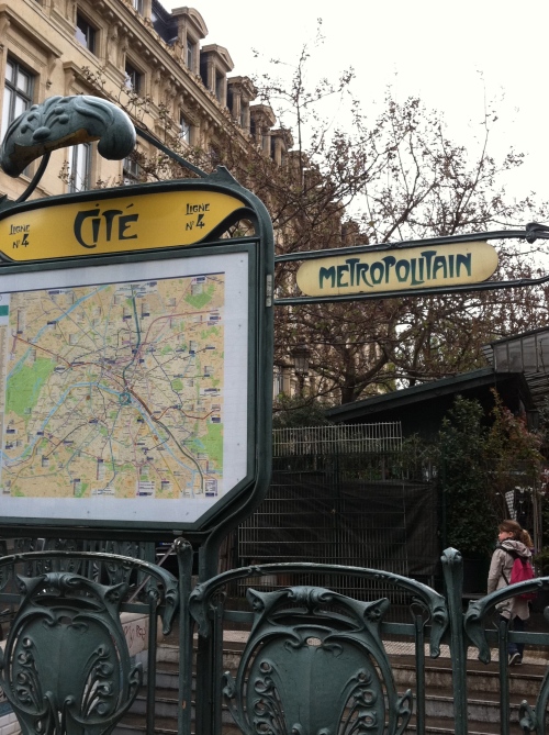
One can only hope that the answer is yes. That day I spent in Paris this past April was cold and rainy, and my boots were soaked through immediately after exiting the Metro. But at the end of my few hours, I emerged at Cité, the Metro stop nearest Notre Dame, and found myself surrounded by a flower market. It was unexpected and breath-taking. Instead of going to the Cathedral right away, I strolled through aisles of hydrangeas, pressed my nose into roses, took pictures of lime trees and birds-of-paradise. I don’t think I could ever not love this.

Emerging from the Metro with the flower market behind


Just my type

Leave a comment

Have you ever really thought about letters? About how the simple act of writing is an art form, and how the science of typography is at once omnipresent and therefore often unnoticed?

I asked my dad these questions the other night, feeling epiphanic. To which he responded, well, yes, actually.

Well, duh. My dad once worked as a graphic designer, is a calligrapher, and an artist of many forms. But I had not given much thought to typography until recently. It’s amazing, really, to consider the varieties of the Roman alphabet that we recognize. Sometimes I catch myself going in and out of cursive when I’m writing fast, and wonder what an alien would think if told that those two types of r signify the same sound. It was certainly confusing to the second- and third-grade students I tutored in literacy.

And, of course, the way we write our language communicates more than just sounds. Recently, Errol Morris provided a passage for the New York Times for readers to gauge whether they were optimists or pessimists. In fact, Morris was trying to prove “the effect of typefaces on truth.” The passage was written in one of six typefaces, and readers were randomly assigned which they read. Only a few readers realized something about the typeface was strange, and these were the readers who’d been assigned the notably bad Comic Sans. Morris found that, of the six typefaces, readers seemed to trust what was written in Baskerville the most. So, if you want people to believe you, choose Baskerville. (Don’t let politicians in on this secret).

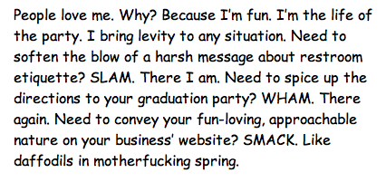
And what of poor Comic Sans? In this case readers trusted it the least, but other studies have shown that teaching concepts in difficult-to-read typefaces actually improves retention in learners. The study specifically tested easy-to-read Helvetica and Arial against Monotype Corsiva and Comic Sans Italicized. There was an uproar earlier in the summer when the the announcement of the Higgs boson particle was made in Comic Sans (one tweet said, “Every time you use Comic Sans on a powerpoint, God kills Schrödinger’s cat. Please think of the cat.”) But perhaps those who studied that powerpoint will remember the data forever. Even if it hadn’t been linked to the God particle, Comic Sans has been immortalized in McSweeney’s most popular article of all time, “I’m Comic Sans, asshole:”

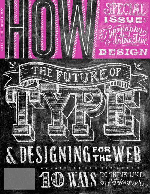
There’s so much more to say about typography, but it’s getting late so I’ll just recommend checking out a few blogs on the subject: typographica, which publishes a favorite-typefaces-of-the-year list, chictype, which is full of lovely letters, and Kottke’s posts on type, which is where I got almost all my information on the subject. If you’re already a word whiz, try these challenges on kerning and letter shaping. And, after all that comic sansing, let’s clean our palettes by watching the wonderful chalk artist Dana Tanamachi create her letter art:

Color your world

Leave a comment

Can you paint with all the colors of the…pantone?

In my current job at an online eyewear company called Eyemusement, I often have minor assignments designing basic promotional materials–newsletters, postcards, press kits, etc. The founders of Eyemusement chose chocolate and turquoise as the main colors, which seem pretty straightforward. I’ve found out, though, that there are approximately 1 million shades of brown and 10 billion shades of turquoise (forget you, EL James–I’m sure there are at least 51 shades of gray!) I know this because I’ve spent many an afternoon trying to match one Hershey’s-chocolate brown logo to a Dove-chocolate brown box. Let’s not even get into the variations between “pool” and “Tiffany’s turquoise.”

Of course, this would all be easier if we chose one Pantone code for each of the two colors and stuck to it. Pantone is the bible of colorists and designers worldwide, offering color charts and palettes, forecasting which colors will be popular in a given year, even making up new colors. (Apparently, making up colors isn’t such a novel thing: a 19th-century British Prime Minister studied every color reference in The Odyssey and The Iliad and found no mentions of blue. In this Radiolab segment, a linguist and neuropsychologist discuss why, across cultures, blue is the last color to appear in human understanding).

While you or I might not associate 2009, for instance, with Palace Blue and Rose Dust (the colors forecasted that year), perhaps in some later year we’ll be able to see a pattern in the popular colors of the 2000s. I found a complete list of color-palette-by-decade since the 1880s, and there are some recognizable trends: the muted tones of the 1920s, the war-inspired colors of the 1940s, the neon-hued 1960s. And, of course, nothing is more iconic of the 1950s than Avocado and Harvest Gold. May they rest in peace.

After so much time spent matching colors, though, I was feeling pretty cocky. I thought I was pretty good at identifying when my chocolate brown needed just a little more red, or my turquoise needed a bit more yellow. And so, when I came across an online color challenge, I was sure I would get a great score. The challenge consists of 4 rows of 20 hues which you must arrange in order, from rose to turquoise to lavender and back. I lined them all up, checked my results…and found out I am terrible at distinguishing hues, except for in a few cases. I was shocked. But heck, even Monet got his colors off a little bit, especially near the end of his life. Maybe this test just signifies that I’m a genius.

Try it yourself.

What score did you get?

Monet: wrong? Or brilliantly right?

PS. Since everything relates back to books for me, here’s a list of 13 authors with corresponding color palettes. Lovely.

Judging a book by its…

Leave a comment

I’m a lifelong bibliophile, a perambulator of bookstores and libraries, wont to picking up books at random and taking them in on a whim. So, of course, I’m a lover of book covers.

And, except for those of us who judge books only on their e-readers, covers matter. A lot. Female British author Lionel Shriver wrote a scathing piece for The Guardian of the gender inequality of cover designs. She rightly complains that the pastel images of wistful women that her publisher’s designers suggest for her are based solely on her gender and have nothing to do with her books–intense narratives, even “nasty,” as she calls them. No one wants the label chic lit, even those who predominantly write for a female audience (I’m looking at you Jodi Picoult).

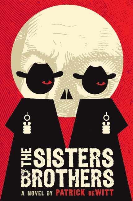
Book buyers tend to form judgements about unknown books within 10-20 seconds of seeing them. Which is why the hardcover copy of last year’s The Sisters Brothers by Patrick deWitt:


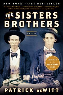
makes such a better first impression than the paperback version:


The hardcover version is a visual double entendre, the paperback a pastel banality that makes me think I’m picking up a dry history of the wild west. Pass.

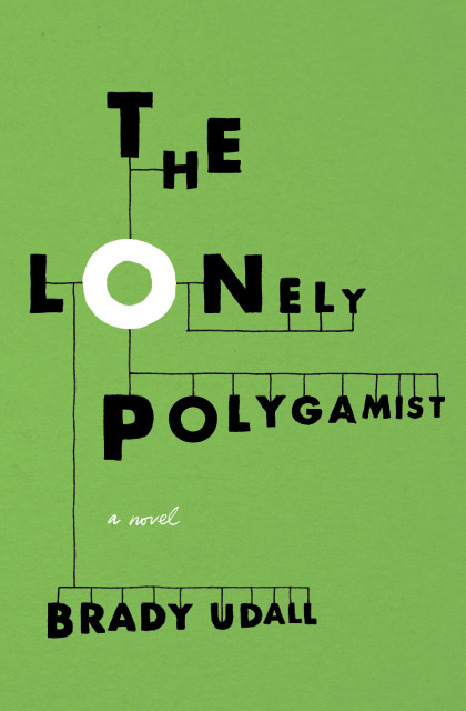
It’s pretty amazing when a book cover makes you do a double take, gives you a complete summary of the book in a single image. Designer Jenny Volvovski is currently creating new covers for books she’s read, and I love her take on Bradley Udall’s The Lonely Polygamist:


The main character has four wives, each with several children, and somehow the letters alone give you a sense of his life. There he is, the lonely O at the center of it all.

I could go on forever about amazing book covers, because there are so many good ones (and several blogs devoted to them). In case you’re interested, here are a lot more awesome book covers. And here’s a list of 30 books that “you should buy for the cover alone.”

But in the age of the e-reader, is the book cover an endangered art form? Chip Kidd, one of the most famous book cover designers of all time, thinks not. NPR quotes him as saying, “[Books] need some kind of visual representation, whether you’re going to be seeing them the size of a postage stamp on a computer screen or a smartphone, or sitting on a table, or on a shelf, or in a bookstore.” Of course, he’s banking on that assumption, given that that’s how he makes a living. I hope he’s right.

Here’s his TED talk on the art of designing a book cover:


How to be a graphic designer

Leave a comment

What you’ll need: at least 2 monitors, Adobe creative suite

Songlist: anything by Bauhaus, Written in Reverse by Spoon

Further reading: um, a graphic novel? No wait, something about graphic design.
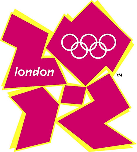
McKayla Maroney is not impressed with this logo.

Ok, last post about the Olympics. I swear.

Now, were you surprised at seeing an image as horrifically ugly as the logo above in a post about graphic design? I don’t know a whole lot about graphic design, so I didn’t follow the unveiling of the 2012 London Olympic logo or the subsequent typeface associated with it, and thus wasn’t aware of the outrage that predated my own. Because, for all my love of the Olympics, and for the million hours I spent watching TV over the past 2 weeks, I just could not get over that horrible, clunky, graceless font. (Last time I checked, the Olympics are not exactly a celebration of clunkiness).

Unfortunately, I didn’t rally any of my fellow Olympics-watchers to my cause:

“Isn’t the typography awful?”

“Eh.”

“I mean, seriously, doesn’t it just make you angry?”

“Shh, the girls are hitting the ball now.”

To console myself, I tried outlining a logo of my own, and quickly noticed that the first two letters of the host city’s name are quite similar to the current year. With a little work, something interesting could be done with that similarity. My own attempts weren’t great, but you’ll see what I mean in the following logo, created by British graphic designer Richard Voysey:
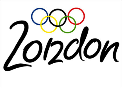
Ahhh, that’s more like it

I felt vindicated both by the Brits’ selection of Mr. Voysey’s design as the “favourite alternative logo” of the games, as well as this design blog’s list of the 8 worst fonts in the world. The London Olympics typeface, called 2012 Headline, ranks #1, worse than Papyrus, worse than Comic Sans (which didn’t even make the list). It can’t get any worse.

But I don’t just want to be one of those Debbie-downer-negative-Nancy complainers. I’ve become much more interested in graphic design over the last year or so, after a) reading blogs that frequently link to lovely infographics* and typefaces and b) having to do very basic graphic design myself for one of my jobs. On Saturday I lugged home 5 enormous history-of-graphic-design books from the library, and I mean to make a serious dent in them. At least by leafing through the pretty pictures.

Look out, world.

*The best infographics I’ve seen are by Nicholas Felton, who produces his annual Feltron report, and Warby Parker’s annual report. Here’s a sample of Nicholas Felton’s work:
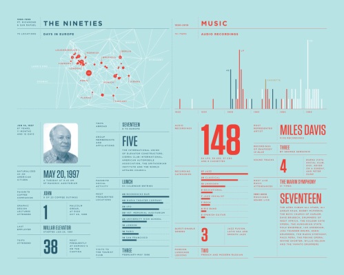
Data done right.

Older Entries