Colour Modes and Spaces – 3

The Mode Palette is under the Image file menu in Photoshop.
In this screen grab you can see that the mode is RGB and we are working with 8 bits per channel – i.e. levels 0 to 255 where 0 is no colour and 255 is maximum colour. So 255 in the red channel means maximum red saturation for the colour space – see this short explanation of how computers define colour
ModePallette

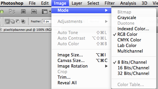
These two settings – RGB Color and 8 Bits Channel are the ones you need to select. Don’t worry about the others for the time being, just check to make sure these options are ticked.
Just to tickle your appetite, maximum saturation varies depending upon the “flavour” of RGB. Red255 will be more saturated in adobeRGB (a wider colour space) than it is in sRGB – that’s why the colour profile attached to the image file is so important – we’ll deal with that later ! )

Colour Modes and Spaces – 2

Grayscale is a single channel mode containing brightness only information based around a single hue – normally gray – which provides a true monochrome image. In this mode a data level of 0 would be black and 256 would be pure white – in print terms this will be paper white. If you convert a colour image to this mode the data in the file will be truly neutral and should give rise to a colour neutral print. If the print shows signs of a colour cast (other than any base tone of the paper itself) this would indicate that the colour management setup or, more likely the printer calibration, is incorrect.
Note that a monochrome image can be, and often is, an RGB mode file with three channels in which case neutrality would be evidenced by the pixel values in all three channels being identical – e.g. R128 G128 B128 would represent a mid gray.
The Info Pallette in Photoshop lets you inspect the values of individual pixels in the image so this provides a useful tool to verify that areas of the image you wish to be colour neutral are indeed so. Again, if such areas print with a colour shift then there is something adrift with colour management or printer settings/calibration/profiling. If the numbers show that the file data is colour neutral but the area appears to have a colour shift on screen this would indicate a badly calibrated monitor. 
One other significant element in colour perception is ones own eyesight and different people see things “differently” – have you had your eyesight tested recently ? Have you ever had a colour vision test?

Colour Modes and Spaces – 1

Colour modes
RGB is a three channel mode – 1 each for Red, Green and Blue
CYMK is a four channel mode – 1 each for cyan, yellow, magenta, and “key” which, to all intents and purposes, means black
Lab is a 3 channel mode – lightness, magenta/green and yellow/blue
For the time being we will stick with RGB Mode for our purposes of spreading enlightenment!
RGB, without any indication of “flavour” is pretty meaningless in terms of colour accuracy – it needs an identifier that tells us what flavour of RGB it is – e.g. sRGB, AdobeRGB etc. It then becomes a colour space identifier and the “profile” is usually attached to the file so that other systems can decide how to handle the colours i.e interpret the numbers 0 -255. An image without an attached profile is rather like having a piece of music without knowing the key. To continue the musical analogy, if all the instruments in a band are “in tune” they will sound good together. Similarly, if all the members of your club have correctly calibrated monitors you should all see each others images as the photographer intended.