This is our poster.

The accompanying abstract is here.
This is our poster.
The accompanying abstract is here.
Stepping back a bit and taking a gander at the big picture:

Seems that the American Association of Geographers doesn’t have a self-evident system for accessing presented posters at their annual meetings, at least for 2021. So, I’m posting this here.

The world maps of the future are probably going to look a lot more like these than like an artfully positioned Oblique Mercator projection. At least when you’ve got ocean matters on your mind.
FYI: if you’re into analog swag, these maps are sized to mount back-to-back.

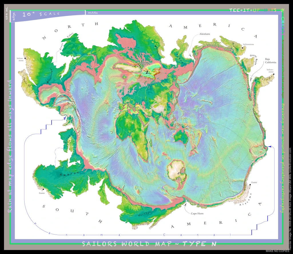
Map edges are continental divides of Africa, Asia, and Europe.
Relative sizes of watersheds around the map edge are directly comparable.
Inland basins attach at their lowest spout.
Relative sizes and internal proportions of oceans and seas are roughly accurate.
Many of the long-distance flights the Nautilus Live crew are talking about can be followed on this map.
Found myself in a discussion yesterday about homogeneous anthropological districts, in particular the USA Black Belt.
Just thought I’d take a look at the present political representation.

This map for Euneika Rogers-Sipp
This map corrects map-boundary imperfections in the earlier Enceladus maps.
Note the smoother curve at the both pole (left and right tips of the map), and the tangent-to-the-vertical cusp.

Enceladus centered on the north pole
Here’s the map in near-maximum resolution. (Click on map for full-size version)
(You might have to open it in a photo-editing software such as Photoshop. I have trouble opening this in Mac Preview.)
(Not sure if this will work; it’s the largest file I’ve yet posted.)
(Yeah. Doesn’t want to open on screen. Try right-clicking on the map and select “download linked file.”)
Suggestions welcome for how to fix this posting glitch. EDIT: the download problem appears to be native to my home computer. Enjoy the map!

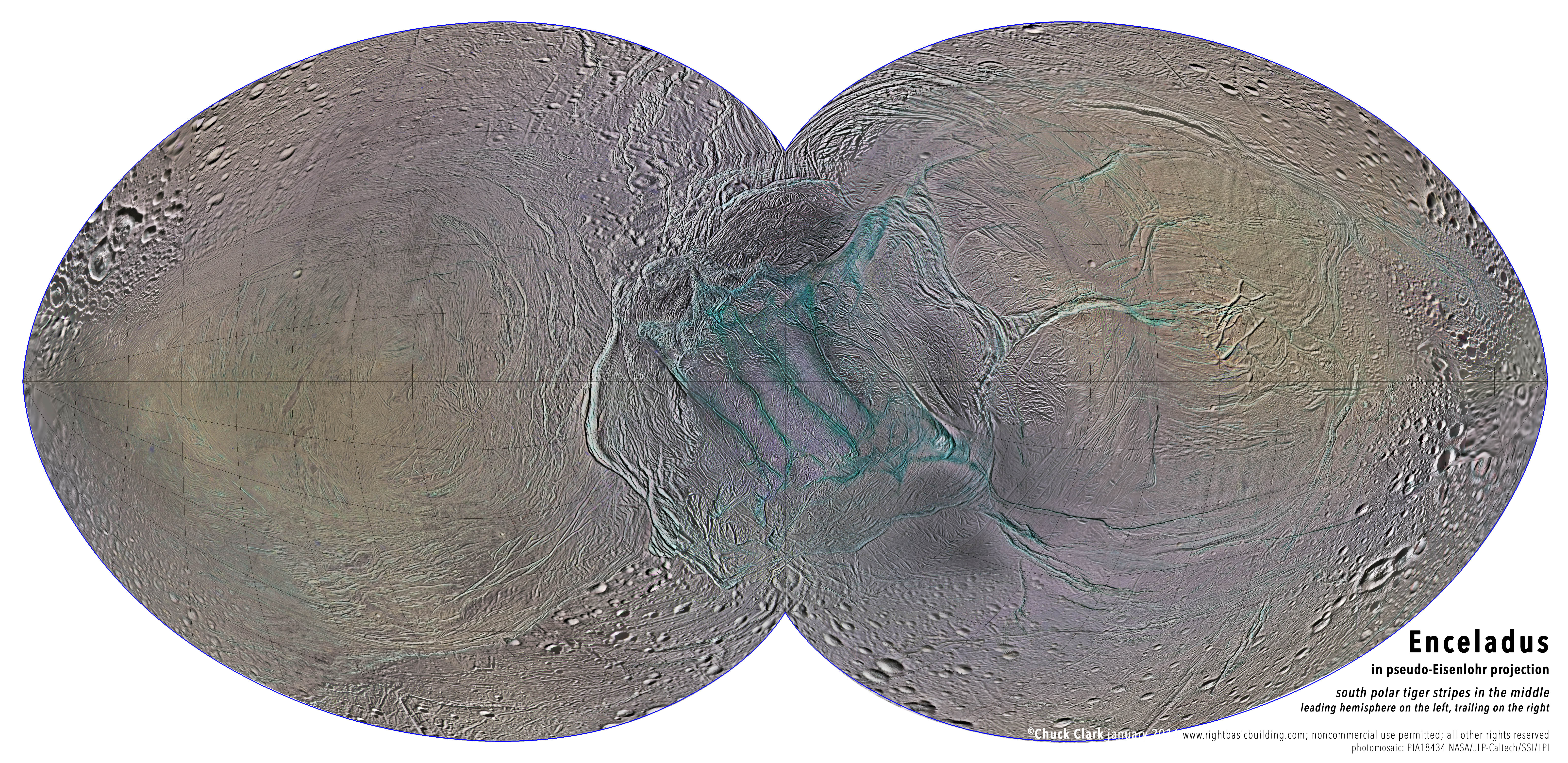 I had to make up the projection. Long story. Summary is that the cut (the edge of the map) is 270˚ (three-fourths of a circle).
The purpose was to put the tiger stripes, the south polar district, into global context. Other compact maps were either unable to make the polar region large enough, relative to the nether regions, or the map periphery went squirrelly.
The cut can turn on 45˚ increments, which has the effect of rotating the stripes around the pole; the lobes refocus from leading and trailing hemispheres (the posted map) to anti- and sub-Saturnian hemispheres.
A really large version is in the works. Maybe by March, knock on wood.
Here’s what the grid looks like:
with a little Photoshopping, you could make your own! Hmm . . . would this projection be of any use on another planet or moon? 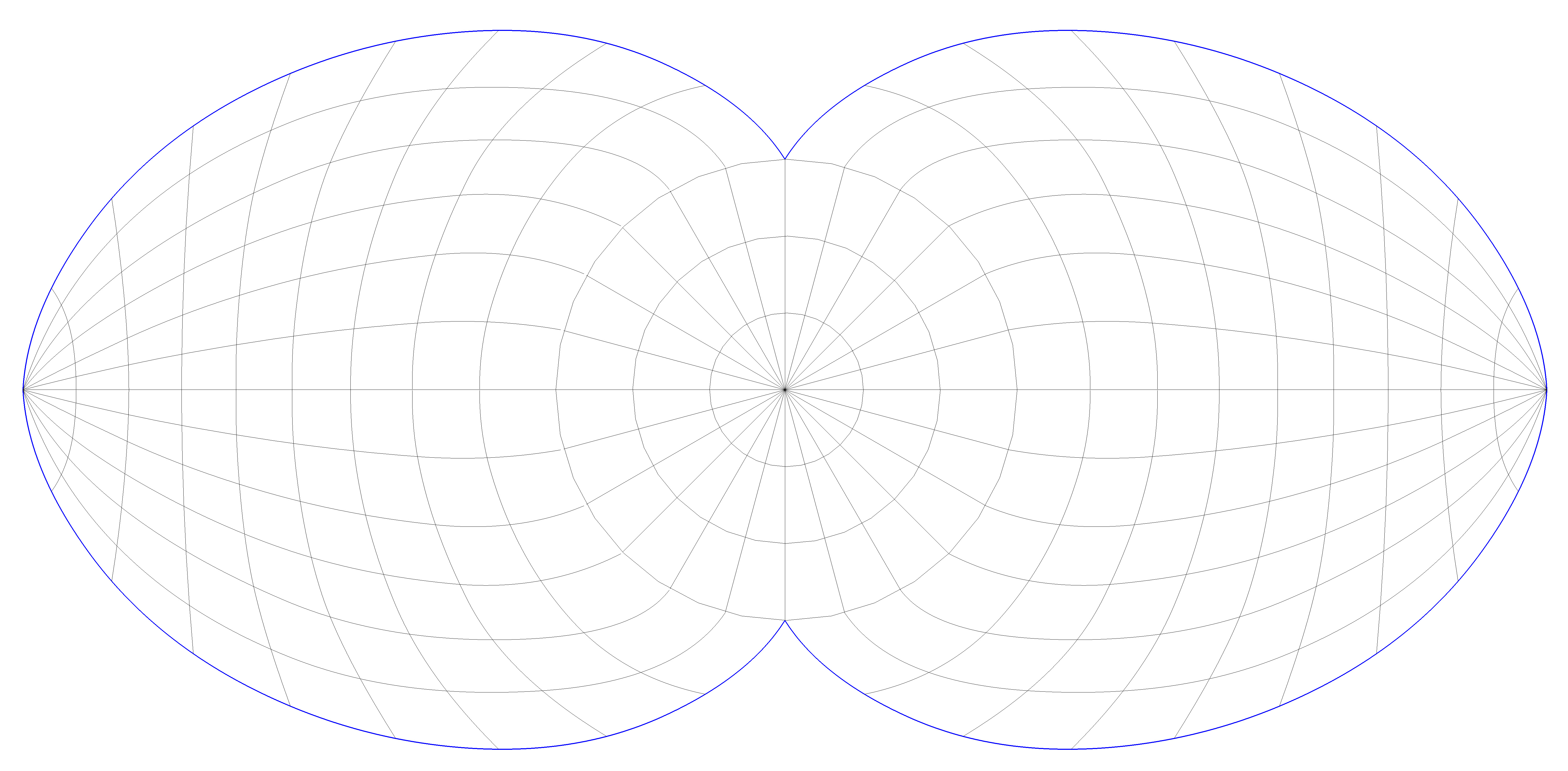
. . . in case anyone has been wanting one.

noncommercial use allowed
The mosaic is based on the July release, so I expect NASA will have something better for us soon.
